A crowded dashboard can make you feel productive while hiding the one number that actually needs attention. That is why looking at the right saas kpi examples matters so much: you need a short list of signals that tells you what to fix, where growth is leaking, and which parts of your business are getting healthier instead of just louder.
If you want the plain-English version, SaaS KPIs are the handful of numbers tied directly to business progress, like recurring revenue, churn, activation, and acquisition efficiency. A good KPI does not just describe activity. It tells you whether your product, revenue engine, and customer base are moving in the right direction.
Here’s what you’ll learn in this guide:
- Which SaaS KPIs matter most
- How KPIs differ from raw metrics
- Revenue, retention, acquisition, and product examples
- Which KPIs fit each growth stage
- How to build a dashboard you will actually use
- Common tracking mistakes that waste time
What SaaS KPI Examples Actually Help You Grow
The problem is rarely a lack of data. The problem is that your dashboard is packed with numbers that do not help you decide what Monday morning should look like. You can see traffic, signups, page views, demos, tickets, and usage events, yet still have no clear answer to one basic question: what should change first?
That is where SaaS KPI examples become useful. A KPI, or key performance indicator, is not just any metric you can measure. It is one of the few numbers that tells you whether your business is improving in a meaningful way. Think of it as the difference between watching every car on the road and checking whether you are actually getting closer to your destination.
The right KPI set helps you spot leaks early. Maybe acquisition looks fine but activation is weak. Maybe MRR is growing, but only because new sales are temporarily covering churn. Maybe support ticket volume is climbing because customers are engaged, or because onboarding is confusing. Good KPIs help you tell the difference before the mess gets expensive.
SaaS KPIs vs. SaaS Metrics
Here’s the simplest way to think about it: metrics are all the numbers you can track, while KPIs are the numbers you should track closely because they connect to your goals.
For example, signups are a metric. Activated users might be a KPI. If your goal is sustainable growth, raw signups only tell you that people raised a hand. Activated users tell you how many actually got to the moment where your product starts making sense. One is interesting. The other changes decisions.
That distinction matters because teams often celebrate volume before value. A signup spike feels good. But if very few of those people complete the key actions that lead to retention, the business is not healthier. It is just busier.
Why tracking the right KPIs beats tracking everything
A shorter KPI list leads to better decisions faster. That is not a theory. It is the practical reality of how teams work.
When every chart looks equally urgent, nothing gets priority. You end up with long meetings, vague takeaways, and no clear owner for the problem. But if your team watches a focused set of numbers tied to acquisition, activation, revenue, retention, and efficiency, patterns get easier to spot. So do tradeoffs.
That is also why it helps to separate a KPI dashboard from a general reporting dashboard. If you want a wider view of supporting numbers, it is useful to understand which SaaS metrics deserve attention across the business. But the KPI layer should stay tight enough that you can glance at it and know what changed.

The Core SaaS KPI Categories You Should Watch
SaaS companies usually drift into trouble when one area gets all the attention and another gets ignored. Obsess over MRR alone and you can miss churn. Chase signups alone and you can miss activation. Improve win rate alone and you can still end up with weak margins.
The healthier approach is to group your KPIs by function. Most sustainable SaaS growth comes from balancing acquisition, revenue, retention, product engagement, and financial efficiency. Each category answers a different question, and together they tell a more honest story.
Acquisition and funnel KPIs
These show how efficiently you turn awareness into leads, leads into opportunities, and opportunities into customers. CAC, lead-to-customer conversion rate, visitor-to-signup rate, and sales cycle length all live here.
This category matters because growth gets expensive fast when top-of-funnel numbers look healthy but the middle of the funnel is broken. You do not want to buy more traffic before fixing what happens after the click.
Revenue and growth KPIs
These track recurring revenue, account size, expansion, and momentum. MRR, ARR, ARPA, ACV, and revenue growth rate tell you how much money is coming in and whether that pace is strengthening or fading.
Revenue KPIs matter most when you compare them over time and alongside retention. Growth without quality is just a temporary sugar high.
Retention and customer health KPIs
Retention KPIs tell you whether customers stay, shrink, or grow after signing up. Churn rate, customer retention rate, NRR, GRR, and logo retention belong here.
If acquisition is the front door, retention is the foundation. Weak retention makes everything else harder, including pricing, forecasting, and hiring.
Product and engagement KPIs
These track whether your product becomes part of a customer’s routine. Activation rate, active users, feature adoption, PQLs, and stickiness metrics like DAU/MAU fit here.
For product-led or hybrid SaaS businesses, this category often tells the truth before finance does. Usage habits tend to rise or fall before revenue catches up.
Financial efficiency KPIs
These connect growth to durability. Gross margin, CAC payback, burn multiple, net burn, quick ratio, and customer concentration tell you whether growth is affordable and resilient.
If you want a broader framework for tying product, revenue, and operations into one scorecard, this category is where the business starts to feel real. Not exciting. Real.
Revenue KPI Examples Every SaaS Team Should Know
Revenue KPIs are the ones most teams check first, and for good reason. They are easy to explain, easy to put in a board deck, and close to the outcome you care about. But revenue numbers can also be misleading when you read them in isolation.
The useful move is to treat each one as a decision tool, not a trophy.
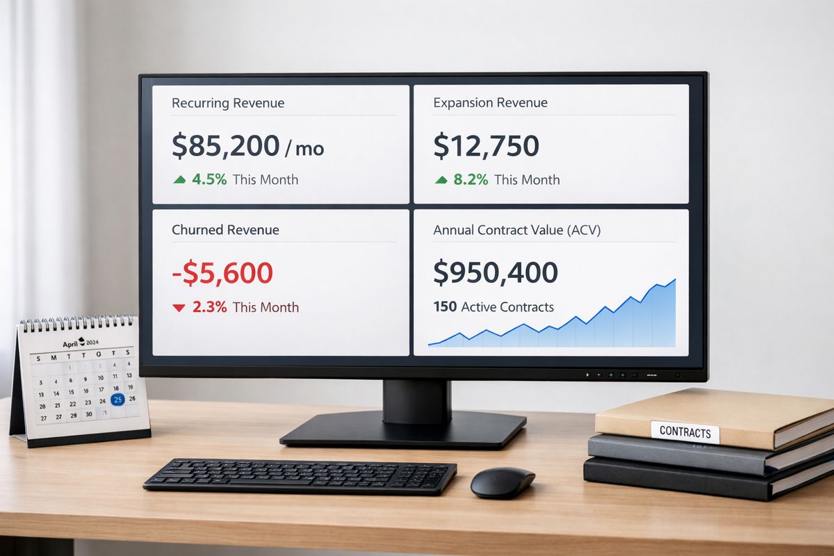
Monthly Recurring Revenue (MRR)
MRR is your predictable subscription revenue for a given month. It is the recurring portion only, not one-time setup fees, service work, or random add-ons unless those repeat predictably.
MRR is usually broken into pieces: new MRR from new customers, expansion MRR from upgrades, contraction MRR from downgrades, and churned MRR from cancellations. That breakdown is where the value is. If top-line MRR is growing but contraction and churn are climbing underneath, you have a future problem in progress.
Use MRR to track monthly revenue momentum, compare growth periods, and understand where gains are coming from. If your expansion MRR keeps carrying the month, that points to strong account growth. If only new MRR is doing the work, retention may be weaker than it looks.
Annual Recurring Revenue (ARR)
ARR is annualized recurring revenue. If MRR helps you manage near-term movement, ARR helps you see the business at a higher altitude. It is especially useful for annual contracts, larger deals, and investor or board conversations.
ARR becomes more helpful as contract sizes increase. In a self-serve SaaS with mostly monthly plans, MRR often gets more attention. In enterprise SaaS with annual agreements, ARR gives a cleaner picture of contract value and planning.
The catch is simple: ARR should not flatten reality. Annualizing a short-lived customer base can make the business look sturdier than it is.
Average Revenue per Account (ARPA)
ARPA tells you how much revenue the average customer account generates over a period, usually monthly or annually. It is one of the fastest ways to understand account quality and pricing power.
A rising ARPA can mean better packaging, stronger upsells, better-fit customers, or a move upmarket. A falling ARPA can point to discounting, weaker customer mix, or acquisition success in lower-value segments. None of those are inherently good or bad. But you should know which one is happening.
ARPA is especially useful when paired with churn. High churn with rising ARPA can mean smaller customers are leaving while larger ones stay. That may be acceptable, or it may signal that your lower-tier offer is not working.
Revenue Growth Rate
Revenue growth rate shows how quickly recurring revenue is increasing over time. Most teams track it month over month and year over year.
This KPI matters because absolute revenue numbers can hide slowing momentum. Going from $100,000 to $110,000 MRR still looks like growth, but the percentage pace matters. If growth rate keeps slowing while CAC rises, your model is getting heavier.
Use this metric to compare periods, channels, pricing changes, or expansion efforts. It is less about celebration and more about slope. Is the curve getting stronger, flatter, or weaker?
Annual Contract Value (ACV)
ACV is the average annual value of a customer contract. It is especially helpful when your business sells multi-year or enterprise deals with contract structures that are not easy to compare.
ACV is not the same as ARR or ARPA. ARR is total annual recurring revenue across the business. ARPA is average revenue per account over a chosen time period. ACV focuses on the average annual contract size, often excluding one-time fees.
Use ACV to decide where your sales motion makes sense. If ACV is low, a long high-touch sales process may be too expensive. If ACV is rising, you may have room for more specialized sales support and customer success.
Retention KPI Examples That Protect Your Growth
Retention is where SaaS businesses either become durable or quietly start slipping. Strong acquisition can cover up weak retention for a while, but only for a while. Eventually the leak shows up in rising CAC pressure, slower growth, and a team that feels like it is running uphill.
If revenue is your pulse, retention is your long-term health.
Customer Churn Rate
Customer churn rate is the percentage of customers who cancel during a given period. This is often called logo churn when you are counting accounts rather than dollars.
It is one of the cleanest ways to answer a painful question: how many customers decided your product was no longer worth keeping? For early-stage SaaS, logo churn is often more useful than revenue churn because account counts are easier to understand before revenue distribution gets complex.
Use churn by segment, not just as one blended number. Customers on monthly plans churn differently from annual customers. Small accounts behave differently from enterprise accounts. One average can hide all of that.
Revenue Churn
Revenue churn measures the recurring revenue lost from cancellations and downgrades over a period. Unlike customer churn, it focuses on dollars, not account count.
This matters more when account sizes vary a lot. Losing one tiny customer and losing one major customer both count as one logo, but the revenue impact is obviously not the same. Revenue churn gives you the economic view.
Many teams track gross revenue churn and net revenue churn separately. The distinction matters because expansion revenue can hide deterioration if you only look at the net result.
Net Revenue Retention (NRR)
NRR measures how much recurring revenue from an existing customer group remains after churn, contraction, and expansion over a period. In plain English, it tells you whether your current customers are shrinking or growing after the sale.
This is one of the strongest SaaS health signals because it captures both retention and expansion. NRR above 100 percent means your installed customer base is growing even before adding new customers. That is a very good sign.
If you want a deeper look at the retention signals that reveal account health over time, start here. NRR is often the metric that makes the rest of the story click.
Gross Revenue Retention (GRR)
GRR measures how much recurring revenue you keep from an existing customer group before counting any expansion revenue. It is stricter than NRR, and that is exactly why it is useful.
A business can post excellent NRR while still having weak GRR if expansions are covering up too much churn and contraction. GRR tells you how stable your revenue base is without the help of upsells.
That makes it a better metric for understanding baseline product value and customer dependency. If GRR is slipping, something fundamental may be off in pricing, onboarding, support, or product fit.
Customer Retention Rate
Customer retention rate is the flip side of churn. Instead of asking how many customers left, it asks how many stayed.
Some teams prefer this framing because it gives clearer target setting. Saying you retain 92 percent of customers each month feels more constructive than saying 8 percent churn. Both matter. The framing just changes the conversation.
Use retention rate when aligning teams around customer success, renewal health, and onboarding quality. It keeps the focus on preservation, not just loss.
Logo Retention
Logo retention tracks the percentage of accounts you keep over time, regardless of revenue changes inside those accounts.
This is especially useful for early-stage SaaS, when account count can be more informative than revenue mix. It also matters in categories where each customer logo carries strategic weight, like B2B tools selling into recognizable brands.
If your logo retention is weak, do not let a few large expanding accounts distract you. The business may still be vulnerable.
Acquisition KPI Examples for Smarter Growth
Acquisition KPIs are where growth ambition meets economic reality. You can grow fast by spending heavily. The question is whether you are buying durable customers at a sane cost.
That is why acquisition metrics should never sit alone. They need context from conversion, retention, and margin.
Customer Acquisition Cost (CAC)
CAC is what you spend to acquire one new customer. Usually that includes sales and marketing costs divided by the number of new customers acquired in the same period.
The catch is that CAC gets distorted easily. If you leave out salaries, commissions, agency costs, or software, it looks artificially low. If you compare spend from one month to customers closed months later, it also gets messy fast.
A clean CAC formula needs aligned time periods and a clear definition of included costs. Otherwise you are just arguing over spreadsheets.
CAC Payback Period
CAC payback period tells you how long it takes to recover your acquisition cost from customer gross profit. It is one of the clearest checks on SaaS efficiency because it forces you to connect spend with cash recovery.
Shorter payback means you get your money back faster and can reinvest sooner. Longer payback increases pressure on cash and raises the cost of aggressive growth.
This KPI becomes especially useful when comparing channels or customer segments. Two channels can have similar CAC, yet very different payback periods because of retention, margin, or ARPA differences.
Customer Lifetime Value (LTV)
LTV estimates how much revenue or gross profit a customer generates before churning. In practice, it is only useful when the assumptions behind it are realistic.
That is why simple LTV formulas often look cleaner than they deserve. If churn is unstable or margins vary a lot, a single LTV number can feel precise while hiding shaky assumptions. Still, it remains helpful as a directional metric.
Use LTV alongside retention and gross margin. Better yet, look at it by segment. A customer from paid search may have a very different lifetime profile than one from product referrals or outbound sales.
LTV:CAC Ratio
The LTV:CAC ratio compares the value of a customer with the cost to acquire that customer. It is popular because it gives a quick read on acquisition economics.
A low ratio usually suggests you are overpaying to grow. An unusually high ratio is not always good news, though. It can mean underinvestment, especially if you are getting efficient customers but not spending enough to scale.
The useful question is not just whether the ratio looks healthy. It is whether the ratio supports your stage, growth goals, and cash position.
Lead-to-Customer Conversion Rate
This KPI measures the percentage of leads that become paying customers. It tells you how efficiently interest turns into revenue.
In self-serve SaaS, this may track signups to paid conversions. In sales-led SaaS, it may follow qualified leads to closed-won deals. Either way, it helps you judge traffic quality, sales effectiveness, and funnel fit.
Low conversion does not always mean bad sales. Sometimes the problem starts earlier with broad targeting or weak qualification.
Visitor-to-Signup Conversion Rate
Visitor-to-signup conversion rate shows what portion of site visitors create an account or start a trial. It is one of the cleanest top-of-funnel indicators.
This KPI helps you judge landing pages, message clarity, offer strength, and traffic quality. If traffic rises but signup conversion falls, the issue may be channel mix. If traffic is flat but signup conversion climbs, your messaging may be getting sharper.
This is also where product positioning gets tested in the real world. At 11:40 p.m., nobody cares about your internal category labels. Visitors either understand the value fast, or leave.
Sales Cycle Length
Sales cycle length measures the time between a qualified lead entering the pipeline and becoming a customer. For sales-led SaaS, it directly affects forecasting, staffing, and cash flow.
Long cycles slow feedback and make growth more expensive. They also make pipeline reporting look healthier than revenue reality. Shorter cycles are usually better, but only if conversion quality holds.
Use this KPI by segment and deal size. Enterprise deals should take longer than self-serve upgrades. The point is not to force every sale through the same clock.
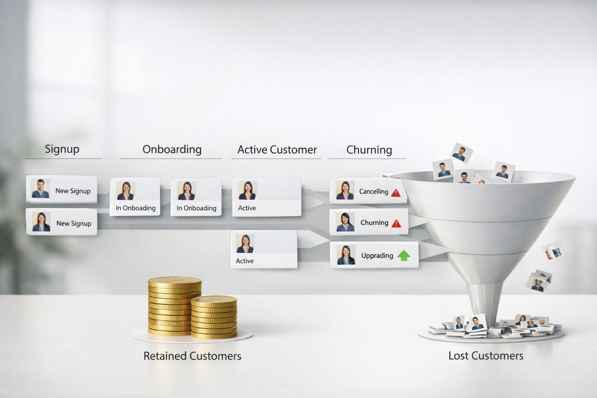
Product and Activation KPI Examples That Signal Real Value
Product behavior often tells the truth before revenue does. If new users never get to value, you will feel the damage later in retention, NRR, and support burden. That is why product and activation KPIs deserve a permanent place on the dashboard, not a side tab nobody opens.
Signups
Signups measure how many people create an account, start a trial, or otherwise enter your product funnel. It is useful, but only at the top of the story.
High signup volume can look great while hiding weak intent, unclear onboarding, or a leaky activation path. A lot of SaaS teams learn this the hard way after celebrating growth that never turns into retained customers.
Treat signups as an input metric. Helpful, but incomplete.
Activation Rate
Activation rate measures the percentage of new users who complete the actions that predict long-term value. Those actions depend on your product. For one tool, activation might mean importing data and inviting teammates. For another, it might mean publishing a first project or automating a first workflow.
The trick is to define activation based on observed behavior, not guesswork. Look at what retained customers consistently do early, then build your activation definition around that.
This metric matters because it links acquisition to future retention. If activation is weak, buying more traffic rarely fixes the actual problem. For a closer look at which in-product behaviors are worth watching, activation is usually the first place to start.
Product-Qualified Leads (PQLs)
PQLs are users whose in-product behavior suggests buying intent or expansion potential. This is especially valuable in product-led growth models, where usage often signals readiness better than a form fill.
A user who hits usage limits, invites multiple teammates, or repeatedly uses a premium feature may be a stronger sales signal than someone who downloaded a guide and booked a demo. That is the logic behind PQLs.
The definition should stay tight. If every active trial becomes a PQL, the label stops being useful.
Active Users (DAU, WAU, MAU)
DAU, WAU, and MAU track daily, weekly, and monthly active users. The real question is what “active” means for your product. Logging in may be too weak. Completing a meaningful action is usually better.
These metrics help you see frequency patterns. Is your product part of a daily habit, a weekly workflow, or an occasional task? The answer shapes onboarding, retention strategy, and product design.
A payroll app and a team chat tool should not aim for the same usage rhythm. Context matters.
DAU/MAU Ratio
DAU/MAU ratio is a simple stickiness metric that compares daily active users to monthly active users. In plain English, it shows how often your monthly users come back.
A higher ratio suggests your product is becoming routine. A lower ratio suggests sporadic or situational use. Neither is automatically good or bad. It depends on what your product is for.
Still, the trend matters. If stickiness drops over time, something about ongoing value may be slipping.
Feature Adoption Rate
Feature adoption rate measures how many eligible users actually use a specific feature. This is especially helpful for high-value features tied to retention, collaboration, or expansion.
Many features get built with a lot of confidence and then quietly sit unused. Adoption data helps you see whether a feature is truly pulling its weight or just taking up space on the roadmap.
Track adoption over time, by segment, and after onboarding changes. A feature can be strong and still underused because discovery is weak.

Sales and Pipeline KPI Examples for Revenue Teams
If your SaaS business uses demos, account executives, or a structured pipeline, sales KPIs deserve their own spotlight. Revenue does not just appear at the end of the month. It moves through stages, and each stage can speed up or slow down growth.
Marketing-Qualified Leads (MQLs)
MQLs are leads that meet agreed marketing thresholds and are ready for closer review. That threshold might include company size, content engagement, fit score, or trial activity.
The catch is that fuzzy MQL definitions create false confidence. If marketing counts almost every hand-raiser as qualified, sales will stop trusting the number.
A useful MQL definition should be specific enough that somebody can look at a lead and know why it belongs there.
Sales-Qualified Leads (SQLs)
SQLs are leads that sales accepts as real opportunities worth active pursuit. This stage matters because it tests whether your funnel is passing along quality, not just volume.
If MQLs are rising but SQLs are flat, the handoff is weak. That could mean poor targeting, loose qualification, or disagreement between teams on what “qualified” actually means.
The formula is not the hard part. Alignment is.
Lead Velocity Rate (LVR)
LVR tracks growth in qualified leads over time, usually month over month. It is useful because lead growth can signal future revenue earlier than closed deals.
This makes LVR a leading indicator. Revenue is a lagging one. If qualified lead volume has been falling for two months, next quarter may already be in trouble even if current bookings still look okay.
That is why LVR is worth watching closely in sales-led SaaS with longer cycles.
Win Rate
Win rate measures the percentage of opportunities that become customers. It tells you a lot about positioning, pricing, qualification, and sales execution.
A weak win rate can mean many things: poor-fit leads, unclear differentiation, pricing friction, or a sales process that loses momentum. It is rarely just one issue.
Use win rate alongside average deal size and cycle length. Sometimes a lower win rate is acceptable if the team is reaching for larger, better-fit accounts.
Average Deal Size
Average deal size is the typical revenue value of closed deals. It helps with forecasting, hiring plans, territory design, and go-to-market strategy.
If average deal size rises, your sales process can support more touch and longer cycles. If it falls, efficiency needs to get sharper. It also affects how much acquisition spend makes sense.
This is one of those simple metrics that quietly shapes a lot of downstream decisions.
Demo-to-Close Rate
Demo-to-close rate measures the percentage of demos that turn into customers. It is especially useful for sales-led SaaS because it focuses on high-intent prospects.
A poor rate here often points to weak demo quality, bad qualification before the demo, or a gap between what prospects expect and what the product actually does.
When this KPI improves, the effect is immediate. More of the intent you already worked hard to generate turns into revenue.
Customer Success and Support KPI Examples That Reduce Churn
https://www.youtube.com/watch?v=s8_Vax8VUmM
Support and success numbers often get treated like service metrics off to the side. That is a mistake. These KPIs can warn you about churn earlier than a finance dashboard can, especially when onboarding friction or unresolved pain starts piling up.
Net Promoter Score (NPS)
NPS measures how likely customers are to recommend your product. It is a sentiment signal, not a behavior signal.
That distinction matters. A customer can say nice things and still churn later. A customer can also be demanding and remain highly loyal. Use NPS as one input, not the truth.
It becomes much more useful when paired with retention, expansion, and support patterns. If scores fall and churn later rises, that pattern matters.
Customer Satisfaction Score (CSAT)
CSAT captures how satisfied customers are with a specific experience, like onboarding, a support interaction, or a feature rollout.
Unlike NPS, which is broad, CSAT is best for pinpointing moments. If onboarding CSAT is weak, you know exactly where to start digging.
This makes CSAT a practical operating metric, especially when tied to team processes and follow-up.
Support Ticket Volume
Support ticket volume measures how many tickets customers create over a period. More tickets can signal friction, but context matters.
A spike might mean something broke. It might also mean more customers are actively using the product. That is why ticket volume should be read alongside active users, release changes, and issue categories.
If you want a better lens on support and success signals that influence renewals, this metric becomes far more useful when segmented by reason and customer type.
First Response Time
First response time measures how quickly your team replies after a customer asks for help. Fast first responses reduce anxiety, even before the issue is solved.
That matters more than some teams realize. Customers who feel ignored often become much harder to save, especially during onboarding or after a billing issue.
This is a trust metric as much as a support one.
Average Resolution Time
Average resolution time tracks how long it takes to fully solve customer issues. Long resolution times often show up later as frustration, weak product sentiment, and churn.
Use this KPI by issue type. Simple password problems should not be mixed with complex technical escalations. One blended average can make support quality look better or worse than it is.
Still, if resolution is dragging across the board, the signal is clear: customers are spending too long stuck.
Onboarding Completion Rate
Onboarding completion rate measures how many new customers finish the setup or education steps required to reach initial value.
This is one of the easiest places to lose future revenue quietly. Customers do not always churn immediately after poor onboarding. Sometimes they drift, underuse the product, and disappear later.
That is why onboarding deserves tight measurement. It shapes retention more than many flashy acquisition campaigns ever will.
Financial Health KPI Examples for Sustainable SaaS Growth
Some finance KPIs sound intimidating until you strip the jargon out of them. At heart, these numbers answer a simple question: is your growth durable enough to keep funding itself, or are you forcing it with cash and hope?
Gross Margin
Gross margin shows how much revenue remains after direct costs of delivering your service are subtracted. In SaaS, that usually includes hosting, support delivery tied to service, and similar cost of goods sold.
This matters because recurring revenue is not all equally useful. A higher gross margin means more of each dollar can fund product, sales, marketing, and operations.
If margin compresses, growth gets heavier. Same revenue, less room.
Net Burn Rate
Net burn rate measures how much cash your business loses each month after revenue is counted. It is the monthly drain on the bank account.
This number matters because even strong top-line growth can be dangerous if burn is climbing too fast. Revenue growth can buy time, but burn determines how much time you actually have.
Watch net burn alongside growth efficiency, not in isolation. Spending more is not automatically bad if it is creating durable momentum.
Burn Multiple
Burn multiple compares net burn to net new ARR. It is a quick way to judge whether growth is getting too expensive.
A lower burn multiple generally means you are generating more new recurring revenue per dollar burned. A higher one suggests growth is costing too much.
This metric became popular for a reason. It cuts through vanity and asks a blunt question: how much cash are you burning to create new recurring revenue?
SaaS Quick Ratio
The SaaS quick ratio compares new and expansion revenue with churned and contraction revenue. It is a compact way to measure growth momentum.
A strong ratio suggests your gains are comfortably outweighing your losses. A weak ratio suggests the business is fighting itself.
This is one of the best glance metrics on a dashboard because it captures both offense and defense in a single number.
Magic Number
The SaaS magic number estimates sales and marketing efficiency based on how much new ARR growth follows a period of sales and marketing spend.
It is a rough indicator, not a perfect one. But it helps answer whether added go-to-market investment is producing enough recurring revenue to justify itself.
Use it directionally. If the trend is weakening, your spend may be outrunning your model.
Customer Concentration
Customer concentration measures how much of your revenue depends on a small number of large accounts. This is especially relevant in enterprise-heavy SaaS.
High concentration creates risk. Lose one big account and growth plans can get punched in the face very quickly.
Even if revenue looks strong, concentration can make the business more fragile than the dashboard suggests.
How These SaaS KPIs Work Together
No KPI should live alone. A dashboard full of disconnected numbers is like having five weather apps open and still not knowing whether to bring a coat. The value comes from relationships between metrics.
Why high growth can hide a churn problem
Strong new bookings can cover weak retention for longer than most teams expect. New logos keep coming in, MRR keeps climbing, and the underlying leak stays hidden.
It is like repainting over a roof leak. The room looks fine for a while, then one rainy month makes the problem obvious. Growth is not proof of health if churn is quietly rising underneath.
Why low CAC is not always good news
Low CAC sounds great until you ask what caused it. Sometimes it means efficient growth. Sometimes it means underinvestment, easy early channels, or a narrow slice of the market that will not scale.
If CAC is low but lead volume is flat and growth is slowing, you may not have found efficiency. You may have found the ceiling.
Why MRR, churn, and LTV should be read as a set
MRR shows current revenue. Churn shows how much of that base is leaking. LTV estimates how much value each customer creates over time. Together, these tell you whether growth is durable or fragile.
This is why your KPI dashboard should connect the numbers into one operating view, not a pile of standalone charts. One metric can flatter. A set of linked metrics tells the truth.
How to Choose the Right SaaS KPIs for Your Stage
One of the fastest ways to waste time is copying a later-stage dashboard before your business is ready for it. Stage matters. Sales motion matters. Pricing model matters. The right KPI set should match what your business is trying to learn right now.
Early-stage SaaS
At an early stage, learning beats dashboard perfection. Focus on activation, retention, onboarding completion, customer feedback, and a few core revenue signals like MRR or early ARR.
At this stage, your biggest risk is false confidence. A polished dashboard cannot fix weak product fit. You need numbers that show whether customers get value and come back.
Growth-stage SaaS
Growth-stage teams need tighter efficiency and segmentation. CAC, CAC payback, NRR, expansion revenue, funnel conversion, and segmented churn all become more important.
This is usually when one blended average stops being enough. Channel quality, plan performance, and customer-size differences start shaping strategy in a bigger way.
Later-stage or scaled SaaS
Later-stage SaaS typically needs stronger board-level and forecast metrics. NRR, GRR, gross margin, burn multiple, customer concentration, and forecast accuracy move higher on the list.
Once the business is larger, the question is not only whether you can grow. It is whether you can grow predictably and without creating hidden risk.
Self-serve vs. sales-led KPI priorities
A self-serve or product-led motion usually cares more about visitor-to-signup rate, activation, PQLs, product usage, and stickiness. A sales-led motion needs tighter reporting on MQLs, SQLs, demo conversion, sales cycle length, and win rate.
Most SaaS companies end up somewhere in between. That is normal. Just do not force a product-led dashboard onto a high-touch sales model, or the other way around.
How to Build a SaaS KPI Dashboard You’ll Actually Use
A good dashboard should feel like a well-set-up kitchen. The tools you reach for most are close, definitions are clear, and you do not waste ten minutes hunting for the one thing you need. If the dashboard is hard to trust or hard to read, nobody uses it consistently.
Pick one owner for each KPI
Every KPI needs a clear owner, even if several teams influence it. Without ownership, numbers get discussed but not managed.
Ownership does not mean blame. It means somebody is responsible for watching the trend, explaining changes, and driving follow-up.
Define every formula in writing
Write every formula down. Seriously.
CAC, churn, activation, active users, and even MRR often mean slightly different things to different teams. Those differences sound small until your board deck and internal dashboard disagree. Then the week disappears into reporting debates.
Segment by plan, channel, cohort, and customer size
Blended averages hide the real story all the time. If churn is flat overall but terrible in one channel, the blended number makes you slow. If ARPA is rising because low-paying accounts are leaving, the average can even make a bad trend look good.
Segmenting by plan, channel, cohort, and customer size helps you find the actual cause instead of staring at symptoms.
Set review cadences that match the metric
Not every KPI needs the same review rhythm. Product usage and funnel movement may deserve weekly review. MRR, churn, and CAC often make more sense monthly. Gross margin, burn multiple, and customer concentration may fit a monthly or quarterly cadence depending on scale.
Matching cadence to metric keeps you from overreacting to noise.
Use trends, not snapshots
One weird month should not send your team into panic mode. Trends matter more than isolated points, especially for metrics influenced by seasonality, billing timing, or contract structure.
Use rolling views, cohort tracking, and comparisons over time. A single snapshot can mislead. A trendline usually tells you what is actually changing.
Common Mistakes When Tracking SaaS KPIs
Most KPI problems do not come from bad intentions. They come from messy definitions, overloaded dashboards, and a habit of copying what looks sophisticated.
Confusing vanity metrics with decision metrics
Traffic spikes, raw signups, and social buzz can feel exciting without improving the business. If a number does not help you make a decision, it is not doing KPI work.
That does not make it useless. It just means it belongs in supporting analysis, not at the center of the dashboard.
Using inconsistent time frames
Comparing monthly CAC with annual LTV, or mixing cohort periods with calendar periods, creates bad decisions fast. The math may look tidy while the logic is broken.
Keep time windows aligned whenever possible. If they are not aligned, label the difference clearly.
Ignoring cohorts
Cohorts show how groups of customers behave over time. Without them, top-line averages can hide retention decay or onboarding improvements.
A cohort view often reveals the truth behind “stable” retention. Newer customers may be doing much worse than older ones, or vice versa.
Tracking too many KPIs at once
A crowded dashboard does not create clarity. It creates hesitation.
If everything is a priority, nothing is. Trim the list until each number earns its place.
Copying another company’s KPI stack
Another company’s KPI setup may be smart for that company and wrong for yours. Pricing model, deal size, product complexity, and sales motion all change what matters.
Borrow ideas, not entire dashboards.
A Simple SaaS KPI Starter Scorecard
You do not need 30 KPIs to run a solid SaaS business. You need a scorecard that covers the business honestly and gets reviewed consistently.
If you can only track 5 KPIs
Start with MRR or ARR, customer churn rate, activation rate, CAC, and NRR or customer retention rate.
That set works because it covers current revenue, acquisition efficiency, product value realization, and the ability to keep and grow customers. It is not perfect, but it is enough to reveal most major issues quickly.
If you can track 10 KPIs
Add ARPA, CAC payback period, LTV, active users, and onboarding completion rate or a support metric like average resolution time.
These additions give you more context. You start to see not just whether growth exists, but whether it is efficient, sticky, and supported by a usable customer experience.
What to review weekly, monthly, and quarterly
Review activation, active users, funnel conversion, support response times, and pipeline movement weekly. Review MRR, churn, CAC, NRR, ARPA, and payback monthly. Review gross margin, burn multiple, customer concentration, and strategic cohort trends quarterly.
That rhythm keeps your team close to operational signals without turning every small fluctuation into a fire drill.
SaaS KPI Examples FAQ
Frequently Asked Questions
What are the most important SaaS KPIs?
The most important SaaS KPIs usually include MRR or ARR, churn rate, NRR, CAC, activation rate, and customer retention. The exact mix depends on your stage and sales motion, but retention and revenue quality should always be near the top.
What is the difference between MRR and ARR?
MRR is monthly recurring revenue. ARR is annual recurring revenue. MRR is often more useful for tracking near-term movement, especially in monthly subscription businesses. ARR is more useful for annual contracts, enterprise SaaS, and higher-level planning.
Which SaaS KPI is best for sustainable growth?
No single KPI wins by itself, but retention-led KPIs usually tell the truth fastest. NRR, GRR, churn, and activation often reveal whether growth is durable or just being propped up by new customer acquisition.
How many KPIs should a SaaS company track?
A focused operating dashboard usually works best with about 5 to 10 core KPIs. You can track more supporting metrics in the background, but your main dashboard should stay tight enough that you can spot change quickly and act on it.
What is a good SaaS churn rate or CAC payback period?
Benchmarks vary a lot by segment, price point, contract model, and growth strategy. In general, lower churn and shorter payback are better, but context matters more than generic averages. A self-serve SaaS and an enterprise platform should not expect the same ranges.
What changes once you start tracking the right KPIs?
You stop reacting to noise and start fixing root problems. Instead of debating which number looks impressive, you can see where acquisition is weak, where customers get stuck, and where revenue quality is improving or slipping.
A useful KPI system should make decisions easier, not make reporting feel heavier. Start small, define each number clearly, and build from there. If you want a simpler way to turn your metrics into a dashboard you will actually use, try AtSpart.