A busy analytics dashboard can make your SaaS look healthy even while revenue barely moves. That is why saas product usage metrics matter so much: they show whether customers are actually getting value, building habits, and moving toward renewal or expansion. Once you can connect usage to money, a lot of hard decisions get simpler.
If you need one plain-English definition up front, here it is. SaaS product usage metrics are the behavioral signals that show how people use your product, how often useful outcomes happen, and which actions connect to retention, upgrades, and churn. They sit between raw activity and business results, which is exactly why they are so useful.
Here’s what you’ll learn in this guide:
- Which usage metrics actually matter
- How to separate signal from dashboard noise
- Where activation, engagement, and retention fit
- How usage connects to MRR, NRR, churn, and LTV
- What to put on a dashboard people will trust
- Which five metrics are enough to start
What SaaS Product Usage Metrics Actually Tell You
A lot of teams track activity. Fewer track value.
That sounds like a small distinction, but it changes everything. Ten thousand logins can look exciting on a Monday morning. If nobody completes a core workflow, invites teammates, or comes back the next week, those logins are decoration.
SaaS product usage metrics tell you whether customers are moving through the product in a way that leads to real outcomes. That could mean a first report sent, a workflow automated, a teammate invited, or an account reaching a steady pattern of weekly usage. The exact action changes by product, but the job of the metric stays the same: show whether value is happening, repeating, and growing.
Product usage metrics vs. business metrics
Product usage metrics measure behavior. Business metrics measure outcomes.
Behavior metrics include activation rate, time to value, feature adoption, stickiness, onboarding completion, and depth of use. Outcome metrics include MRR, ARR, churn, CAC, LTV, and NRR. One tells you what customers are doing. The other tells you what happened to the business because of it.
You need both. If you only track business metrics, you are steering by the rearview mirror. Churn tells you damage already happened. NRR confirms expansion already landed. If you only track product metrics, you can end up celebrating engagement that never turns into durable revenue.
The useful move is to connect them. When accounts that adopt Feature A retain 22 percent better, that matters. When customers from one acquisition channel activate quickly but churn after 60 days, that matters too. The full picture comes from linking behavior to business outcomes, not treating them as separate worlds.
Why usage data is the missing link in revenue growth
Here’s the thing: revenue growth gets easier when you know which actions inside the product predict money outside it.
Usage data helps you answer questions that finance metrics cannot answer on their own. Which trial users are most likely to convert? Which customers are drifting before churn shows up on an invoice? Which features drive upgrades instead of curiosity clicks? Which segments find value fastest?
Once those links are visible, decisions stop being guesswork. Product can fix the workflows that stall activation. Growth can improve targeting based on who activates and retains. Customer success can intervene before usage collapses. Sales can prioritize product-qualified accounts that are already showing intent inside the product.
That is the missing link. Revenue does not appear out of nowhere. It usually follows repeated product value.

Start With a Simple Metrics Framework, Not a Giant Dashboard
Most dashboards are too crowded to be useful. A screen full of charts feels serious, but honestly, it often hides the fact that nobody knows what to do next.
A better approach is to start with one top-line goal, then work downward. Pick the core outcome you care about, identify the usage metrics that influence it, and then map the levers your team can actually change. That creates a simple chain from action to result.
If you are sorting through a wider list of numbers worth keeping an eye on, this framework keeps the list from turning into noise.
Pick your North Star metric
Your North Star metric should reflect recurring customer value, not random product activity.
That means avoiding metrics like total signups, page views, or raw login counts. Those can rise while your business gets worse. A good North Star points to the moment your product delivers ongoing value at account level.
For a collaboration product, that might be weekly active teams. For reporting software, it could be reports sent per active account. For workflow automation, it might be successful workflows launched each week. The test is simple: if this number grows in a healthy way, does customer value probably grow with it? If the answer is no, it is not your North Star.
Separate leading indicators from lagging indicators
Leading indicators tell you what is likely to happen. Lagging indicators tell you what already happened.
Activation rate, time to value, feature adoption, seat utilization, and engagement scores are leading indicators. MRR growth, churn, and NRR are lagging indicators. You want both, but not on the same cadence.
Leading indicators deserve weekly attention because they move early and give you time to respond. Lagging indicators usually make more sense monthly because they reflect broader commercial results. If you review churn every day, you will mostly stare at noise. If you review activation once a quarter, you will miss obvious problems while they are still fixable.
Group metrics into acquisition, activation, engagement, retention, and expansion
This grouping keeps the journey clear.
Acquisition tells you who enters the product. Activation shows whether new users get to value. Engagement reveals whether usage is becoming a habit. Retention proves that value lasts. Expansion shows whether usage grows into more revenue.
This structure also makes ownership clearer. Growth often owns acquisition quality. Product usually owns activation and feature adoption. Customer success watches retention and health. Revenue teams care deeply about expansion signals. Everyone stays aligned because the stages connect instead of competing.
Acquisition Metrics That Set Up Better Product Usage
Bad acquisition creates bad usage data. If your funnel pulls in the wrong people, the product will look weak even when the real problem is fit.
That is why front-end metrics matter. Not because volume is exciting, but because the right volume creates healthier activation, retention, and expansion later.
Lead-to-trial and visitor-to-signup conversion
These two rates tell you whether your message attracts the right kind of customer.
Visitor-to-signup conversion measures how many site visitors start an account or trial. Lead-to-trial goes a bit deeper, especially in sales-assisted motions, by showing how many qualified leads actually enter the product experience. Strong numbers suggest your positioning is clear and appealing. Weak numbers often point to a mismatch between what you promise and what people expect.
But more signups are not automatically good. If conversions climb after a looser homepage promise, then activation drops and churn rises, you did not improve the funnel. You just widened the top with lower-intent traffic.
Customer acquisition cost (CAC) and CAC payback
CAC is how much you spend to acquire a customer. CAC payback is how long it takes to recover that cost from gross profit.
Simple enough. The useful part comes when you break CAC down by source and compare it to activation and retention. A paid channel with high CAC can still be healthy if those accounts activate fast, stick around, and expand. A cheaper channel can be worse if customers never really adopt the product.
That is why acquisition efficiency should not live in a silo. It becomes much more useful when paired with behavior inside the product.
Product-qualified leads and product-qualified accounts
In PLG or hybrid SaaS, usage often tells you more than a demo request ever could.
A product-qualified lead, or PQL, is a user who shows meaningful intent through behavior. A product-qualified account goes one level up and looks at account-wide signals like multiple activated users, repeated feature use, invited teammates, or usage near a plan limit. These are the people already leaning in.
This is one of the clearest ways product data supports revenue. Instead of guessing who might buy, you can prioritize accounts already acting like successful customers.
Activation Metrics: The First Proof That Your Product Clicked
Activation is the point where curiosity turns into value. Before that, users are just poking around.
This matters because a lot of early SaaS drop-off happens before anyone feels the product pay off. If a new user signs up at 9:14 a.m., clicks through setup, and leaves by 9:19 without doing anything meaningful, that is not a product relationship. That is a missed chance.
Define the activation event
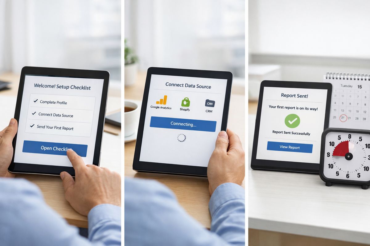
An activation event is the action, or sequence of actions, that signals a user has crossed from trying the product to getting real value from it.
The trick is to choose a value moment, not a housekeeping task. Filling out a profile is rarely activation. Connecting a data source might be, if it unlocks the main product outcome. Sending the first invoice, publishing the first dashboard, automating the first task, or inviting a teammate into a shared workflow are usually stronger candidates.
A good activation event has three traits. It happens early enough to matter, clearly connects to product value, and correlates with retention later.
Activation rate
Activation rate is the percentage of new users or accounts that reach the activation event within a defined period.
The formula is simple: activated users divided by new users, over a time window. If 400 new trial accounts sign up in a month and 120 hit your activation event, your activation rate is 30 percent.
What makes this metric powerful is how easy it is to compare. You can track activation by acquisition source, pricing plan, company size, onboarding path, or persona. Those cuts quickly show where friction lives. If one segment activates at half the rate of another, you probably do not have a general product problem. You have a fit, messaging, or onboarding problem.
Time to value (TTV)
Time to value measures how long it takes a new user to reach the first useful outcome.
Shorter is usually better. The sooner someone gets a result, the less room there is for confusion, distraction, or buyer’s remorse. If your product takes ten days to feel useful, a lot of people will disappear before day three.
Shrinking TTV often has a multiplier effect. Trial conversion improves because users get the point sooner. Retention improves because early wins create momentum. Expansion improves because accounts that reach value faster usually explore more. In many SaaS products, improving TTV is the closest thing to fixing several funnel stages at once.
Onboarding engagement rate
This metric tracks whether new users progress through onboarding steps, but the catch is that onboarding completion is not the same as activation.
Someone can finish a checklist and still not understand why the product matters. So use onboarding engagement rate as a friction measure, not a success measure. It helps you spot where people stall, skip, or abandon the setup flow.
The practical way to use it is to pair checklist progress with value milestones. If users complete all setup steps but fail to activate, your onboarding may be polished but pointless. That is worth fixing before you celebrate a high completion rate.
Engagement Metrics That Show Whether Usage Is Becoming Habit
After activation, the next question is simple: do people come back and do useful things again?
This is where weak products quietly lose customers. Signups look fine. Activation looks decent. Then usage thins out until renewals become awkward conversations.
DAU, WAU, and MAU
DAU, WAU, and MAU stand for daily, weekly, and monthly active users. The key word is active.
Your active definition should reflect meaningful use, not a bare login. For a team chat product, sending a message or participating in a thread may count. For finance software used once a month, generating a report or closing a workflow may be more realistic.
Pick the time window that matches natural product frequency. Daily collaboration tools care about DAU. Weekly operational tools often care more about WAU. Month-end finance products may learn more from MAU. One window is not more sophisticated than another. It just needs to fit the product.
Stickiness ratio
Stickiness is usually measured as DAU divided by MAU, or WAU divided by MAU. It tells you how often active users return within a broader period.
A higher ratio usually points to stronger habits, but context matters. A payroll product with a modest DAU/MAU ratio can still be healthy because customers do not need it every day. A project collaboration tool with the same ratio may have a problem.
The number matters less than the pattern. If stickiness improves after onboarding changes or feature improvements, you are probably making the product more habit-forming.
Sessions, key actions per session, and depth of use
Sessions alone are weak. Productive sessions are useful.
Look at what happens during a session. How many tasks get completed? How many records get updated? Are users exporting reports, launching workflows, inviting teammates, or creating repeatable outputs? Key actions per session show whether time in the product leads to work getting done.
Depth of use goes further. It shows how much of the product’s real value customers tap into over time. If an account logs in often but only touches the shallowest workflow, engagement may be overstated.
Customer engagement score
A customer engagement score combines several signals into one number. Usually that includes recency, frequency, feature depth, seat usage, and account activity.
Done well, it gives you a fast health-style view of which accounts are active, stable, drifting, or at risk. Done poorly, it becomes a black box nobody trusts. Keep the formula simple enough that someone can explain it without opening a spreadsheet.
If you want a stronger operational view of which health signals to watch across the customer journey, this is where product usage starts becoming truly actionable.
Feature Adoption Metrics That Reveal What Actually Drives Value
https://www.youtube.com/watch?v=s8_Vax8VUmM
Not every feature deserves equal attention. Some drive retention. Some drive expansion. Some are basically decorative.
Feature adoption metrics help you see the difference.
Feature adoption rate
Feature adoption rate measures the percentage of users or accounts that use a specific feature in a defined period.
The practical detail that matters is scope. Track adoption for important features, not every button in the interface. A feature deserves measurement when it ties to core value, monetization, retention, or product strategy.
You can calculate adoption by user, account, plan, role, or segment. Account-level adoption is often more useful for revenue because one curious user clicking once is not the same as a team building the feature into normal workflow.
Breadth of adoption vs. depth of adoption
Breadth asks how many users or accounts tried a feature. Depth asks how heavily they use it.
You need both because they answer different questions. High breadth and low depth may mean a feature is easy to find but not useful enough to keep. Low breadth and high depth may mean the feature is valuable for a specific audience but hidden or poorly positioned.
A lot of product teams stop at breadth and miss the real story. A feature used once by 60 percent of accounts can look successful. If only 8 percent use it repeatedly, that feature probably has discovery, usability, or value problems.
Core feature usage vs. nice-to-have feature usage
This split sharpens product conversations fast.
Core features are the ones customers rely on to get the main job done. Expansion features increase value, scale, or convenience. Nice-to-have features may create delight, but they are not doing much for retention or revenue.
You want to know which features are actual retention drivers. Which ones show up again and again in healthy accounts? Which ones appear in expanding accounts? Which ones barely move no matter how much you promote them? Once you know that, roadmap and packaging discussions get less emotional and much more useful.
Feature adoption by cohort or segment
Blended adoption numbers hide a lot.
Feature use often varies by company size, persona, acquisition channel, plan, onboarding experience, and maturity. A reporting feature that looks weak overall may be a major retention driver for mid-market finance teams. A collaboration feature may matter only once an account has three or more active seats.
This is where segmentation becomes commercially useful. It can inform packaging, onboarding, customer success playbooks, and product-led sales motions. It also helps you avoid building strategy around average behavior that barely exists in any real customer group.
Retention Metrics That Protect Revenue You Already Won
Retention is where product usage proves itself. A flashy first week means very little if value disappears by month three.
This section matters because retaining revenue is usually cheaper, faster, and more reliable than replacing it.
Customer retention rate
Customer retention rate measures the percentage of customers or accounts that remain active customers over a period.
At a simple level, it answers one question: of the customers you started with, how many did you keep? You can measure monthly, quarterly, or annually, depending on contract length and product rhythm. For many SaaS businesses, account-level retention is more useful than user-level activity because contracts renew at the account level.
Retention gets stronger when paired with product usage signals. If retained accounts consistently show fast activation, broad seat usage, and repeated core workflows, those patterns become a blueprint.
Cohort retention analysis
Cohorts group customers by start month, acquisition source, plan, or another shared trait, then track retention over time.
This is one of the clearest ways to see whether your product is improving. If the March cohort retains better than the January cohort after an onboarding update, that tells you something useful. If enterprise accounts retain well while self-serve accounts collapse after month two, that tells you something even more useful.
If you are building a broader view of how retention numbers reveal growth quality, cohort analysis is where the story usually becomes obvious.
Logo churn vs. revenue churn
Logo churn is the percentage of customers you lose. Revenue churn is the percentage of recurring revenue you lose.
The difference matters. Losing five small customers can sting less than losing one large customer that downgrades or leaves. If you only track logo churn, you might miss concentration risk. If you only track revenue churn, you might miss a broad small-customer problem that becomes larger later.
Both belong in the same view because they answer different business questions.
Early warning signs of churn
Churn rarely appears out of nowhere. Usage usually softens first.
Watch for declining seat usage, lower admin activity, fewer key workflows completed, stalled adoption of core features, support frustration, delayed onboarding milestones, or long gaps between meaningful sessions. Those patterns often show up weeks or months before a cancellation.
That is why product usage metrics are so valuable to customer success and revenue teams. They create a chance to intervene while the account is still salvageable.
Revenue Metrics Connected to Product Usage
Usage does not matter in isolation. It matters because it affects money.
When you connect the two, product analytics stops being a side conversation and becomes part of growth strategy.
Monthly recurring revenue (MRR) and annual recurring revenue (ARR)
MRR is your normalized recurring revenue each month. ARR is the annualized version.
Both are finance metrics, but product behavior often hints at where they are heading. If key accounts are expanding seat usage, adopting premium features, and increasing workflow volume, MRR may rise before contracts formally change. If usage depth falls across a segment, revenue pressure is often coming.
A lot of teams review MRR without enough context. A richer view links it to account health, activation quality, and feature use. That is where a cleaner dashboard for revenue and product signals starts to pay off.
Expansion revenue rate
Expansion revenue rate measures how much additional revenue comes from existing customers through upgrades, seat growth, add-ons, or cross-sells.
This is one of the best places to use product usage metrics because expansion rarely comes out of nowhere. It tends to follow wider seat adoption, deeper feature use, increased workflow volume, and moments where customers run into plan limits.
When you know those signals, upsell timing improves. Instead of pushing every account at renewal, you can focus on accounts already growing inside the product.
Net revenue retention (NRR)
NRR measures how much recurring revenue from your existing customer base remains after churn, contraction, and expansion.
In plain English, it tells you whether your current customers are worth more or less over time. That is why many SaaS leaders treat NRR as one of the cleanest growth metrics available. Strong NRR usually reflects real customer value, because expansion is outpacing loss.
Usage patterns often explain NRR movement long before finance reports tell the full story. Better activation, stronger adoption, and healthier account engagement usually push NRR up. Weak usage in important segments usually pulls it down.
Customer lifetime value (LTV) and LTV:CAC ratio
LTV estimates how much revenue or gross profit a customer generates over the life of the relationship. LTV:CAC compares that value to acquisition cost.
A lot of people treat LTV as a marketing math problem. It is not. Product quality changes LTV all the time. Better retention raises it. Expansion raises it. Faster activation can raise it because more customers survive long enough to become valuable.
That is the catch. You cannot improve LTV only by acquiring customers more cheaply. Sometimes the smarter move is to improve product behavior so customers stay longer and grow more.
Customer Health Scoring: Turning Usage Signals Into Action
A health score is useful when it helps you decide what to do next. If it is just a color-coded label in a dashboard, it is not doing much.
The best health scoring models combine a few meaningful product and account signals, then trigger action.
Build a health score from behavior that matters
Start with inputs that connect to retention or expansion. Activation completion, recency of core actions, frequency of use, breadth of seat adoption, depth of feature usage, support friction, and billing status are common building blocks.
Keep the formula understandable. If nobody can explain why an account is yellow instead of green, the score will lose credibility fast. A simpler model that captures 80 percent of the signal is far better than a fancy model no one trusts.
Tailor health thresholds by customer segment
A five-seat startup account and a 500-seat enterprise account should not be judged by the same standard.
Smaller accounts may show healthy usage with only one or two active champions. Larger accounts need broader seat penetration, admin engagement, and cross-team adoption. Segment-specific thresholds make the score more realistic and much more useful.
This is also where pricing tier, use case, and maturity matter. A brand-new customer should not be measured like a mature account in month 18.
Trigger interventions before churn happens
A health score should create motion.
If usage drops sharply after onboarding, trigger in-app guidance or lifecycle email support. If seat adoption stalls in a larger account, customer success outreach makes sense. If an account is heavily engaged and hitting plan limits, that is a sales expansion signal.
The value is not in predicting churn with perfect precision. The value is catching drift early enough to do something about it.
How to Build a SaaS Product Usage Dashboard That People Will Actually Use
A good dashboard answers questions quickly. A bad one turns into a scrolling museum of unused charts.
The difference usually comes down to focus, definitions, and cadence.
Build dashboards around questions, not just charts
Start with the questions each team needs answered. Which trials stall before activation? Which accounts are likely to expand? Which feature predicts retention? Which cohort got healthier after the onboarding change?
Once the questions are clear, the chart choices become obvious. Without that framing, dashboards become collections of metrics that look useful but never lead to decisions.
Define your events and users clearly
Messy tracking ruins trust faster than almost anything else.
Define events in plain language. Keep naming consistent. Make sure account identity is stable across devices and users. Capture the properties that matter, such as plan, role, source, workspace, feature, or workflow type. If the same action is tracked three different ways, analysis becomes a mess.
This is not glamorous work, but it pays off. Clean instrumentation is the foundation for every useful dashboard, cohort, and health model.
Review metrics on the right cadence
Different metrics need different rhythms.
Operational alerts can be watched daily. Product and growth reviews often work best weekly. Revenue trends, CAC payback, and NRR usually make sense monthly. The point is to review often enough to act, but not so often that normal fluctuation looks like a crisis.
A simple cadence also reduces dashboard fatigue. People are more likely to use a dashboard when they know exactly what it is for.

Common Mistakes That Make SaaS Metrics Look Better Than Reality
This is the part where a lot of teams realize the dashboard was flattering them.
The mistakes are common, and most of them come from measuring what is easy instead of what matters.
Tracking vanity metrics instead of value metrics
Page views, signups, raw event volume, and total sessions can all look great while the business struggles.
Vanity metrics create motion without insight. Value metrics show whether customers get outcomes, come back, renew, and expand. If a number cannot help explain revenue quality or customer value, it probably deserves less attention.
Treating all active users as equal
One login is not the same as meaningful usage.
A user who signs in, glances at one screen, and leaves should not carry the same weight as a user who completes a core workflow and invites two teammates. Define active usage around value, not presence. That single change improves almost every downstream metric.
Measuring outputs before strategy
A lot of teams build dashboards first, then try to decide what matters.
That order usually creates clutter. Start with business goals and customer behavior instead. What outcome are you trying to improve? Which actions inside the product influence it? Which metrics would show progress early? Start there, then build the dashboard.
Confusing engagement with retention
Frequent use today does not guarantee renewal tomorrow.
Some customers are highly active because they are in a setup phase, a migration phase, or a short-term project. Retention needs a longer view and account-level context. Engagement helps, but it is not the whole story.
Ignoring segments, cohorts, and account context
Averages hide problems beautifully.
Your overall activation rate can improve while enterprise activation falls. Your blended churn can look stable while a key acquisition channel collapses. Your feature adoption number can look healthy while core customers ignore the feature completely.
Context is what turns metrics into decisions.
Best Practices for Turning Metrics Into Revenue Growth
Collecting metrics is easy compared to using them well. The teams that get real value from product usage data do three things consistently: assign ownership, run experiments, and keep a shared language.
Link every key metric to an owner and a next step
A metric without an owner becomes trivia.
For each important metric, decide who watches it, what threshold matters, and what action follows movement. If activation falls, who investigates? If health scores drop in a segment, who reaches out? If expansion signals rise, who gets notified?
This sounds basic, but it is where a lot of reporting falls apart.
Run experiments around activation, adoption, and expansion
Use metrics to guide changes you can actually test.
That may mean shortening onboarding, changing a trial prompt, surfacing a feature earlier, adjusting lifecycle email timing, or triggering success outreach when seat adoption stalls. Measure the before and after by cohort, not just overall averages. Small product changes often create outsized revenue effects when they improve activation or retention.
Use product usage data in pricing and packaging decisions
Pricing gets sharper when it reflects how customers get value.
If heavy-use accounts consistently grow through seat count, usage-based thresholds, or premium workflows, your packaging should acknowledge that. If your most valuable features are buried in plans that are too generous or too restrictive, adoption data will reveal the mismatch.
This is one reason the right set of growth-focused metrics matters beyond analytics. It helps you decide what to charge for and where expansion should come from.
Create a shared language across product and revenue teams
Nothing wastes time faster than arguing about definitions in the middle of a meeting.
Agree on what counts as activation. Define active usage clearly. Decide how health scores work. Use the same meaning for churn, expansion, and retention across product, finance, sales, and success. That shared language reduces friction and speeds up decisions, especially in startups where one term can mean three different things by Friday afternoon.
SaaS Product Usage Metrics by Growth Stage
Not every company needs the same setup. A seed-stage product and a later-stage SaaS business should not carry the same analytics burden.
The right metric stack depends on what you are trying to prove next.
Early-stage SaaS: focus on activation and retention first
If you are still proving product-market fit, keep the list tight.
Focus on activation rate, time to value, cohort retention, one core feature adoption metric, and a simple North Star. That set tells you whether people get value and come back. At this stage, that matters more than building a giant revenue model.
Growth-stage SaaS: add expansion and efficiency metrics
Once you have reliable activation and decent retention, add the next layer.
Start watching NRR, expansion revenue, CAC payback, health scoring, and feature adoption by segment. These metrics help you scale without losing quality. They also create stronger alignment between product, growth, and revenue teams.
More mature SaaS: optimize forecasting and account-level behavior
Larger SaaS companies usually need richer account-level analysis.
This includes renewal forecasting, expansion propensity, concentration risk, usage-based account scoring, and clearer signals for product-led sales motions. At this stage, the challenge is less about collecting data and more about turning a lot of data into a clean operating model.
A Practical SaaS Product Usage Metrics Starter Set
You do not need fifty metrics to get started. You need a handful that cover the path from first value to durable revenue.
That is enough to make better decisions this week, not six months from now.
If you can only track 5 metrics, start here
Start with activation rate, time to value, adoption of one core feature, cohort retention, and either NRR or MRR growth.
That set covers the full journey. Activation rate shows whether new users get it. Time to value shows how quickly value appears. Core feature adoption reveals whether customers use what matters most. Cohort retention tells you whether value lasts. NRR or MRR growth connects behavior to money.
If these five are defined clearly and reviewed regularly, you will already know far more than many teams with twenty dashboards.
If you can track 10, add these next
Next add CAC payback, stickiness, expansion revenue rate, customer health score, and churn by cohort.
Each one sharpens a blind spot. CAC payback adds acquisition efficiency. Stickiness helps you judge habit strength. Expansion revenue shows growth inside the base. Health score makes intervention easier. Churn by cohort reveals whether changes are actually helping over time.
Your first 30-day cleanup plan
Start by defining activation in one sentence. Then clean the events tied to that moment so your tracking is trustworthy. Build one dashboard around a few real questions, not a pile of charts. Review one cohort to see where value drops off. Then trigger one intervention, maybe a shorter onboarding path, a targeted prompt, or outreach to at-risk accounts.
That is enough for the first month.
Do not rebuild everything at once. Pick one concrete change, test it, and learn from it.
Frequently Asked Questions
What are SaaS product usage metrics?
SaaS product usage metrics are measurements of how customers interact with your product in ways that reflect value. Common examples include activation rate, time to value, feature adoption, stickiness, retention, and depth of use. The useful ones connect customer behavior to business outcomes like renewal and expansion.
Which SaaS product usage metrics matter most first?
Start with activation rate, time to value, one core feature adoption metric, cohort retention, and either MRR growth or NRR. That gives you coverage from first value to long-term revenue without overwhelming your team.
How do product usage metrics reduce churn?
Usage metrics reveal drop-off patterns before churn appears in billing data. Falling seat adoption, fewer core workflows, declining admin activity, or stalled feature use often show up early. That gives you time to intervene with onboarding help, customer success outreach, or product guidance.
What is the difference between engagement and retention?
Engagement measures current behavior, such as active use, repeat sessions, or feature depth. Retention measures whether customers stay over time. A customer can be highly engaged for a short burst and still churn later, which is why both views matter.
How often should you review SaaS product usage metrics?
Review leading indicators like activation, onboarding friction, and health signals weekly. Watch operational alerts daily if needed. Review lagging business metrics like churn, NRR, and CAC payback monthly so you can spot trends without overreacting to short-term noise.
How do you choose a good North Star metric for SaaS?
Choose a metric that reflects recurring customer value, not surface-level activity. A good North Star rises when customers are getting meaningful outcomes more consistently. Examples include weekly active accounts, workflows completed, or reports sent per account.
Put One Metric to Work This Week
The smartest move is not building a bigger dashboard. It is choosing one usage metric that clearly connects to revenue, defining it properly, and acting on it.
Try AtSpart to turn product usage signals into a clearer view of activation, retention, expansion, and revenue growth, without drowning in noisy charts.