Your MRR Numbers Look Fine — But Are They Lying to You?
MRR cohort analysis is a method of grouping SaaS customers by their subscription start month and tracking how much of their original revenue — and how many accounts — survive over time. Instead of one blended MRR number, you see exactly which customer groups are growing, shrinking, or churning.
Here's a quick summary of what it tells you:
- What it measures: Revenue retention (GRR and NRR) and customer retention per signup group, tracked month by month
- Why it matters: Blended MRR can trend upward while older cohorts silently decay — cohort analysis exposes that gap
- Key metrics: Gross Revenue Retention (GRR), Net Revenue Retention (NRR), logo retention, and monthly churn rate
- How often to review: Monthly is standard; fast-growth teams sometimes review weekly
- Healthy benchmarks at Month 12: GRR ≥ 90%, NRR ≥ 110%, logo retention ≥ 85%
Think about this for a moment. Your total MRR is climbing. New logos are coming in. The board deck looks clean.
But underneath that number, your January cohort might be quietly bleeding out while your March cohort expands. You can't see that in a blended metric.
That's exactly the problem cohort analysis solves. As one common observation in SaaS finance puts it: blended MRR can appear healthy even when the underlying cohorts are deteriorating. A single churn percentage hides every decision worth making — which cohorts are declining, which acquisition channels produce customers who actually stay, and whether your NRR can support the runway you're modeling.
For a finance or RevOps lead, that's not just an analytics gap. It's a strategic blind spot that affects hiring decisions, fundraising timelines, and customer success investment.
This guide walks you through everything: how to build a cohort table, what the numbers mean, how to read the curve shapes, and what actions to take based on what you find.
What is MRR Cohort Analysis and Why Does It Matter?
To manage a subscription business successfully, you have to look beyond aggregate figures. A Cohort Analysis breaks down your customer base into distinct, time-bound segments. Instead of treating your entire customer base as a single, uniform pool, cohorting groups users who shared a common starting experience—typically, the calendar month they paid for their first subscription.
When we look at MRR through this lens, we are tracking the financial lifecycle of those specific groups over time. This approach is fundamental to understanding your SaaS Business Metrics. It answers a simple but vital question: What happens to the dollars brought in by the customers who joined us in a specific month as time goes on?
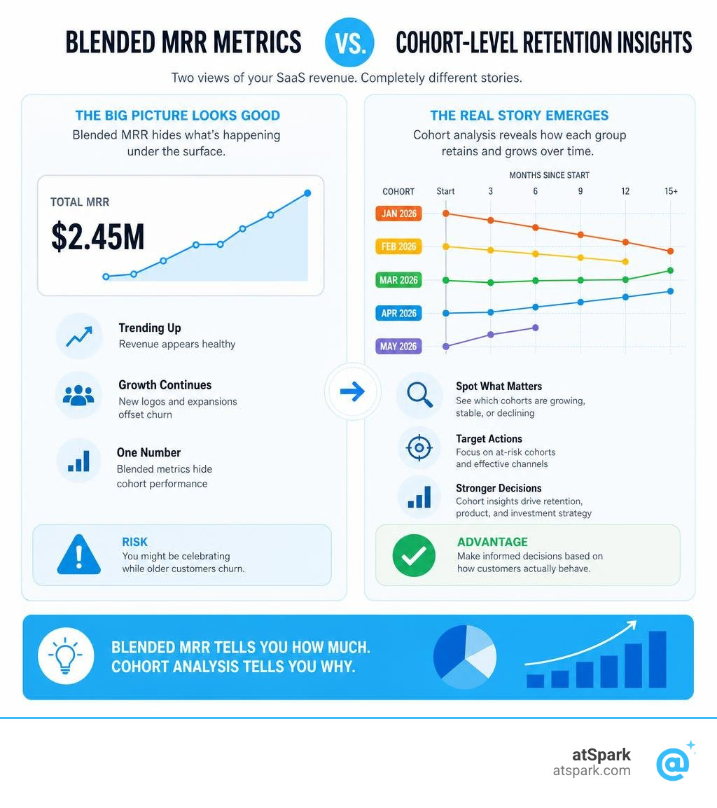
Blended MRR vs. Cohort-Level Insights
Relying solely on your top-line MRR Growth Rate is like looking at the average temperature of an entire continent. It tells you a number, but it completely hides the localized storms.
Aggregate reporting blends new customer acquisition with existing customer behavior. If your sales team has an incredible month, those new signups will easily mask a severe churn issue in your older customer base.
In reality, you have a leaking bucket. If you rely purely on blended SaaS Performance Metrics, you won't realize you have a retention crisis until your acquisition velocity slows down and your growth flatlines. MRR cohort analysis isolates these variables. It separates the "new business" engine from the "customer retention" engine, showing you exactly how sustainable your growth really is.
Customer Count vs. Revenue-Based Cohorts
When performing a cohort analysis, you must track two distinct dimensions:
- Customer Count (Logo Retention): How many actual accounts remain active.
- Revenue Retention (MRR Retention): How much monthly recurring revenue those accounts generate.
Comparing these two views is incredibly revealing. For instance, your logo-based Customer Churn Rate might look high, but your Revenue Churn could be exceptionally low—or even negative. This happens when the customers who stay with you upgrade their plans, offsetting the revenue lost from the smaller accounts that cancelled.
Conversely, you might experience a scenario where you retain 100% of your customers but only 50% of your revenue. This occurs when customers downgrade their subscription tiers or reduce seat counts. If you only track logo retention, you will miss this massive contraction in value perception.
Key Metrics and Benchmarks for SaaS Cohorts
To evaluate the health of your cohorts, you need to understand the industry standard indicators. Tracking SaaS Customer Retention Metrics at the cohort level requires focusing on two core metrics: Gross Revenue Retention and Net Revenue Retention.
| Metric | Focus | Formula Elements | 12-Month Target (Green) |
|---|---|---|---|
| Gross Revenue Retention (GRR) | Core product value & stability | Starting MRR - Churn - Contraction | ≥ 90% |
| Net Revenue Retention (NRR) | Business expansion & scalability | Starting MRR - Churn - Contraction + Expansion | ≥ 110% (SMB) / ≥ 120% (Enterprise) |
| Logo Retention | Customer satisfaction & ICP fit | Remaining Customers / Starting Customers | ≥ 85% |
Gross Revenue Retention (GRR) vs. Net Revenue Retention (NRR)
Gross Revenue Retention (GRR) measures the percentage of recurring revenue retained from an existing cohort, excluding any expansion revenue. It only accounts for the negative movements: churn and contraction. Because it cannot include upgrades or add-ons, GRR can never exceed 100%. It is the truest indicator of whether your product is delivering on its core promise and keeping customers from leaving.
Net Revenue Retention (NRR), on the other hand, includes the positive movements: Expansion MRR (upgrades, seat additions, cross-sells) and reactivations, alongside Contraction MRR and churn.
An NRR above 100% means your cohort is expanding organically. You are growing your revenue from existing customers without spending a single dollar on new customer acquisition. If you want to check your own numbers, you can use our NRR Calculator to quickly see where you stand.
Red, Yellow, and Green Benchmarks at 12 Months
As of July 2026, the benchmarks for B2B SaaS performance have stabilized around highly disciplined capital efficiency. The 2025 median B2B SaaS GRR sat at approximately 90%, with top-quartile companies exceeding 95%.
Meanwhile, the median NRR was 101%—barely above flat. This means most SaaS companies are only just covering their gross churn with expansion. Best-in-class companies (often enterprise-focused) sustain NRR above 120%.
To understand where your business fits within these SaaS Growth Metrics, use these 12-month cohort benchmarks:
- Gross Revenue Retention (GRR):
- Green: ≥ 90%
- Yellow: 80% to 90%
- Red: < 80%
- Net Revenue Retention (NRR):
- Green: ≥ 110% (SMB) / ≥ 120% (Enterprise)
- Yellow: 100% to 110%
- Red: < 100% (indicating your customer base is shrinking in value over time)
- Logo Retention:
- Green: ≥ 85%
- Yellow: 70% to 85%
- Red: < 70%
Your target monthly churn rate also depends heavily on your target market:
- SMB-focused SaaS: A monthly churn of 3% or below after stabilization is strong (green); 3% to 7% is the typical range (yellow).
- Mid-Market SaaS: Below 1% monthly churn after month three is the target.
- Enterprise SaaS: Below 0.5% monthly churn is expected due to longer implementation cycles and higher contract values.
Reading the Curve: What Your Cohort Shape Reveals About Product-Market Fit
Visualizing your cohorts on a retention curve chart is one of the fastest ways to diagnose your product’s health. By plotting the percentage of retained MRR or logos on the y-axis against the number of months since signup on the x-axis, you create a visual signature of your customer relationships.

Shape 1: The Steep Drop and Plateau (Healthy Retention)
A healthy SaaS retention curve typically drops during the first one to three months and then flattens out into a horizontal line (a plateau).
The initial drop represents early churn—customers who signed up but quickly realized the product wasn't the right fit, or who failed to complete onboarding. Once the remaining customers cross the activation threshold and find continuous value, they stop churning.
If your curve plateaus at a high level (e.g., 80% logo retention), you have solid product-market fit. Your customer success team simply needs to focus on helping early users reach that "aha" moment faster to minimize that initial drop.
Shape 2: The Steady Linear Decline (Activation Failure)
If your retention curve looks like a slide, steadily declining month after month without ever flattening out, you have a fundamental product-market fit or activation issue.
This shape indicates that customers are continuously losing interest and leaving. There is no core group of users who find permanent value in your software.
Adding more customer success managers (CSMs) or offering discounts won't fix this. You need to talk to your customers, re-evaluate your Ideal Customer Profile (ICP), and figure out why the product is failing to deliver long-term value.
Shape 3: The Month 12 Cliff (Renewal Friction)
A curve that stays relatively flat but drops precipitously at month 12 is a classic sign of annual contract renewal friction.
During the first 11 months, these customers couldn't churn because they were locked into annual agreements. But when the renewal date arrived, they walked away.
This pattern reveals that while your sales team is great at closing annual deals, your product or customer support team failed to drive continuous engagement throughout the year. It can also point to pricing misalignment or procurement hurdles at the time of renewal.
How to Build and Model Your Cohort Data
Before you can run a MRR cohort analysis, you need clean, normalized data. If you are pulling data from billing platforms like Stripe, you must normalize different billing periods into a standard monthly figure using an MRR Calculator. You should also ensure that you anchor your cohorts using the first-payment date rather than the signup date to avoid distorting your metrics with trial users.
How to Build an MRR Cohort Analysis Table
To build a cohort matrix in Excel or Google Sheets, you need to structure your raw data into "customer-month" rows. Each row should contain:
Customer IDCohort Month(the first month they made a payment)Observation Month(the month you are measuring)Tenure Month(calculated asObservation Month - Cohort Month)MRR
Once your raw data is structured, you can use a SUMIFS formula to build the classic triangular cohort matrix. For a step-by-step breakdown of setting up this spreadsheet, you can review the guide on Cohort Analysis in Excel: Step-by-Step for SaaS — Meritra.
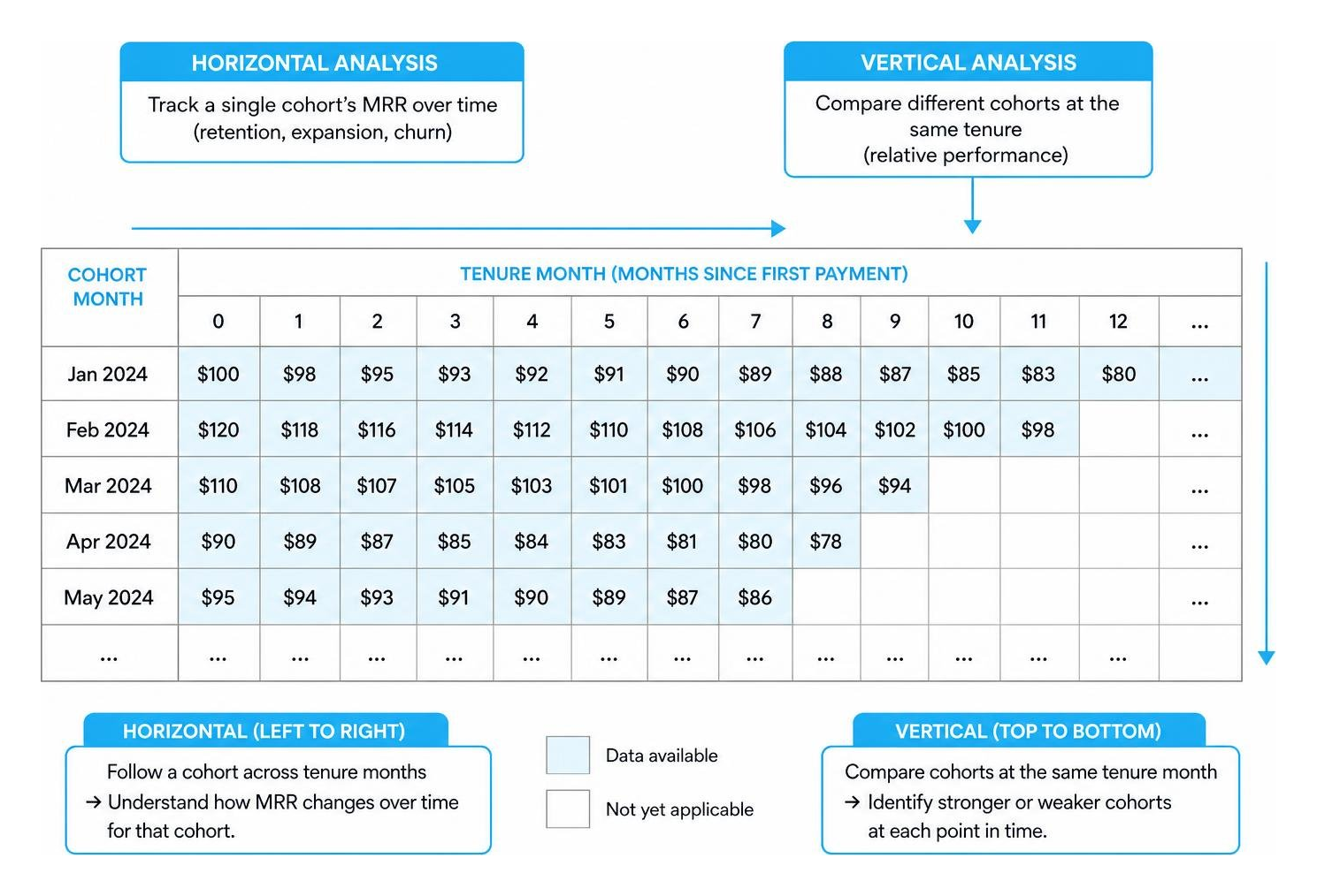
A typical triangular matrix aligns cohorts horizontally by their signup month, with tenure months extending to the right:
Diagnosing Churn and Expansion with MRR Cohort Analysis
To turn your cohort table into decisions, perform these three analytical reads:
- The Vertical Read (Month 3 Checkpoint): Scan down the "Month 3" column across successive cohorts. If your March cohort had 80% retention at Month 3, but your May cohort has 65% retention at Month 3, something went wrong recently. You may have changed your pricing, brought in lower-quality leads, or introduced a bug in your onboarding flow.
- The GRR-to-NRR Gap: Compare the Gross Revenue Retention and Net Revenue Retention of the same cohort. A wide gap means you have a highly effective expansion engine. However, if your NRR is 115% but your GRR is only 75%, expansion is masking a massive churn problem. If your expansion opportunities dry up, your revenue will drop quickly.
- Logo vs. Revenue Divergence: If logo retention is dropping but revenue retention is stable or growing, you are successfully upselling your largest accounts while losing smaller, low-margin accounts. This is a clear signal that you should adjust your marketing to target larger organizations.
For more on turning retention data into operational decisions, see SaaS cohort analysis: how to turn retention data into decisions.
Forecasting Future MRR, LTV, and Runway
Cohort analysis is also a powerful forecasting tool. Instead of assuming a flat, arbitrary churn rate across your entire business, you can apply your historical cohort decay curves to project future revenue.
For example, if you know that historically, a cohort retains 70% of its MRR at Month 6 and 60% at Month 12, you can project the future cash flows of your newest cohorts with incredible accuracy. This helps you calculate a highly realistic Customer Lifetime Value (LTV), optimize your CAC payback periods, and manage your runway safely.
To learn how to build these forecasting frameworks, read SaaS Cohort Revenue Modeling: Practical Framework to Forecast MRR, NRR, and Runway.
Common Pitfalls in Cohort Modeling and How to Avoid Them
Building a cohort model is highly rewarding, but a few small data errors can completely ruin your insights.
Pitfall 1: Blending Trial and Paid Users
If you anchor your cohorts to the user's initial signup date (which often includes free trials), you will severely distort your early retention metrics. Your Month 1 retention will look terrible because all the trial users who didn't convert will show up as "churned."
Always anchor your cohorts to the first-payment date. This ensures you are only analyzing the behavior of actual, paying customers.
Pitfall 2: Inconsistent Cohort Definitions and Active Status
If you change your definition of an "active" customer halfway through your analysis, your historical comparison will be useless. Similarly, if you do not account for mid-month upgrades, downgrades, or plan changes correctly, your MRR calculations will be inaccurate.
To maintain data integrity, establish clear rules for how to handle reactivations and downgrades, and make sure you have a dedicated owner for your financial assumptions.
Frequently Asked Questions about Cohort Analysis
How often should SaaS teams review MRR cohorts?
SaaS teams should review their MRR cohorts monthly during the financial close cycle. This cadence allows you to spot emerging trends, evaluate customer success initiatives, and adjust your forward-looking assumptions before issues impact your runway.
What does it mean when a cohort's revenue retention exceeds 100%?
When a cohort's NRR exceeds 100%, it means the cohort has achieved net negative churn. The expansion revenue generated from upgrades, add-ons, and seat expansions within that specific group of customers is greater than the revenue lost from cancellations and downgrades.
Why is first-payment date preferred over signup date for cohort anchors?
Using the first-payment date as your cohort anchor ensures that your analysis only includes committed, paying customers. Including free trial signups in your cohorts creates unnecessary noise, artificially inflating your customer acquisition metrics and making your early retention look much worse than it actually is.
Get Instant Cohort Insights Without the Spreadsheet Headache
Building and maintaining MRR cohort tables in spreadsheets is time-consuming, complex, and prone to formulas breaking. If you want to skip the manual data modeling and get instant, accurate cohort insights, we can help.
atSpark is an AI-powered analytics platform for SaaS companies that unifies your billing, CRM, and subscription data. With atSpark, you don't need to write complex SQL queries or spend hours debugging Excel sheets. You can simply ask plain-English questions like:
"Show me my MRR cohort retention by plan tier for the last 12 months"
Our platform instantly generates the exact charts, tables, and insights you need to make data-driven decisions. Ready to see how your cohorts are actually performing? Build your SaaS KPI Dashboard with atSpark today.