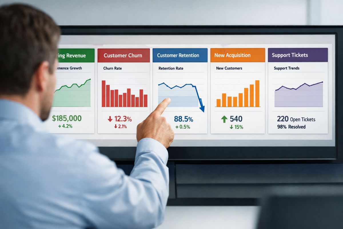
A SaaS KPI dashboard saves you from the weekly ritual of opening twelve tabs, staring at three different spreadsheets, and still not knowing whether your business is actually healthy. It gives you one place to track the numbers that matter most, so you can spot trouble earlier, move faster, and stop making decisions on gut feel alone.
A SaaS KPI dashboard is a single view of your most important software business indicators, usually covering revenue, acquisition, retention, product usage, and customer health. The best dashboards do not collect every number you can measure. They surface the handful of metrics tied directly to growth, efficiency, and long-term durability.
What a SaaS KPI Dashboard Actually Does
A dashboard is not just a prettier spreadsheet. It is the operating view for your business.
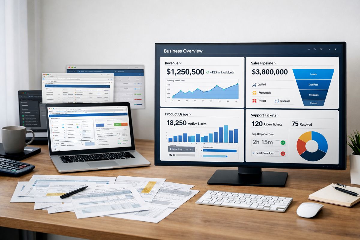
At the simplest level, a SaaS KPI dashboard pulls your key numbers into one place so you can understand what is happening right now and what is changing over time. That usually means recurring revenue, churn, retention, customer acquisition cost, product engagement, pipeline, and support signals. When those numbers live together, patterns become easier to see. You stop treating each team like a separate island.
It also helps to separate four terms that get mixed up all the time. A metric is any measurable number, like daily signups or tickets created. A KPI is a metric that matters enough to judge performance against a business goal. A report is usually more detailed and often built for analysis after the fact. A dashboard is the live summary view, the one you check quickly to understand the state of the business before digging deeper.
SaaS KPIs vs. SaaS Metrics
Every KPI is a metric, but most metrics do not deserve KPI status.
That sounds obvious, but it is where plenty of dashboards go sideways. If you track 40 numbers on one screen, nothing stands out. A KPI earns its place because it connects directly to a goal. MRR connects to revenue growth. NRR connects to customer expansion and retention. CAC connects to efficiency. Activation rate connects to product onboarding quality. A vanity number, by contrast, looks busy without helping you decide anything.
Here’s the trick: a metric becomes a KPI when you would actually change behavior if it moved. If weekly active users dip, would you investigate onboarding, bugs, or feature friction? If yes, it belongs. If a chart looks interesting but never changes a conversation, keep it in a supporting report, not your main dashboard.
Why a Dashboard Beats Scattered Spreadsheets
Spreadsheets work in the beginning. Honestly, they can work longer than some people admit. But the catch is trust.
Once billing data sits in one sheet, CRM exports live in another, and product usage gets copied from an analytics tool every Friday afternoon, version-control problems start creeping in. One tab includes refunded accounts, another does not. One formula uses monthly churn, another annual churn. Monday’s meeting turns into a debate about which cell is right.
A good dashboard fixes that. It reduces hunting, cuts manual updates, and gives everybody the same view of the business. More importantly, it shortens the time between noticing something and acting on it. That is why a dashboard is not a nice extra. It is the control panel.
Why Your SaaS Business Needs One Source of Truth
Most SaaS companies do not have a data problem at first. They have a fragmentation problem.
Revenue sits in a billing tool. Pipeline lives in the CRM. Campaign data hides inside ad platforms. Product usage shows up in an analytics tool. Support tickets sit somewhere else. Each system tells part of the story, but not enough to answer the question you actually care about: is your business getting stronger or weaker?
A source of truth means your key numbers come from agreed definitions and trusted systems. That does not magically clean every data issue overnight, but it gives you one place where decisions begin. Without that, each team ends up defending its own numbers.
Faster Decisions Across Teams
When everybody works from the same dashboard, decisions speed up because the meeting starts with reality instead of reconciliation.
If churn ticks up, your customer success team can flag renewal risk, your product team can look for usage drop-off, and your revenue team can assess whether contraction is concentrated in one segment. No waiting for separate exports. No “that’s not the number I have.”
That shared visibility matters even more when things move fast. A sudden drop in activation after a product release, a CAC spike from one paid channel, or a dip in expansion revenue from enterprise accounts can get expensive quickly. A unified dashboard lets you catch the signal before month-end closes the door on easy fixes.
Better Visibility Into What’s Working
Growth rarely breaks in one dramatic moment. It slips gradually.
Maybe signups look steady, but activation is down. Maybe new MRR is fine, but expansion is slowing. Maybe customer count is rising while ARPA quietly shrinks because your mix is shifting toward lower-priced plans. Those are the kinds of patterns a dashboard helps you notice.
When your numbers sit side by side, comparison gets easier. You can line up acquisition channels against paid conversion, compare cohorts after onboarding changes, or spot the week a support backlog started hurting retention. If you want a broader look at the numbers behind healthy scaling, this guide on the metrics that shape stronger growth decisions goes deeper into how those signals work together.
Cleaner Accountability Without Micromanaging
Visible KPIs make ownership clearer without turning every check-in into a status interrogation.
If CAC rises, somebody owns the investigation. If first response time slips, somebody sees it before customers start complaining loudly. If activation drops, somebody can trace whether the problem started with traffic quality, onboarding friction, or product confusion.
That is a better form of accountability than endless reporting. You are not asking for updates just to feel informed. You are giving each function a scoreboard that everyone understands.
The Core Metrics Every SaaS KPI Dashboard Should Include
Most SaaS KPI dashboards get cluttered because every team wants one more chart. Resist that instinct. Start with the numbers that show business health, then add supporting detail underneath.
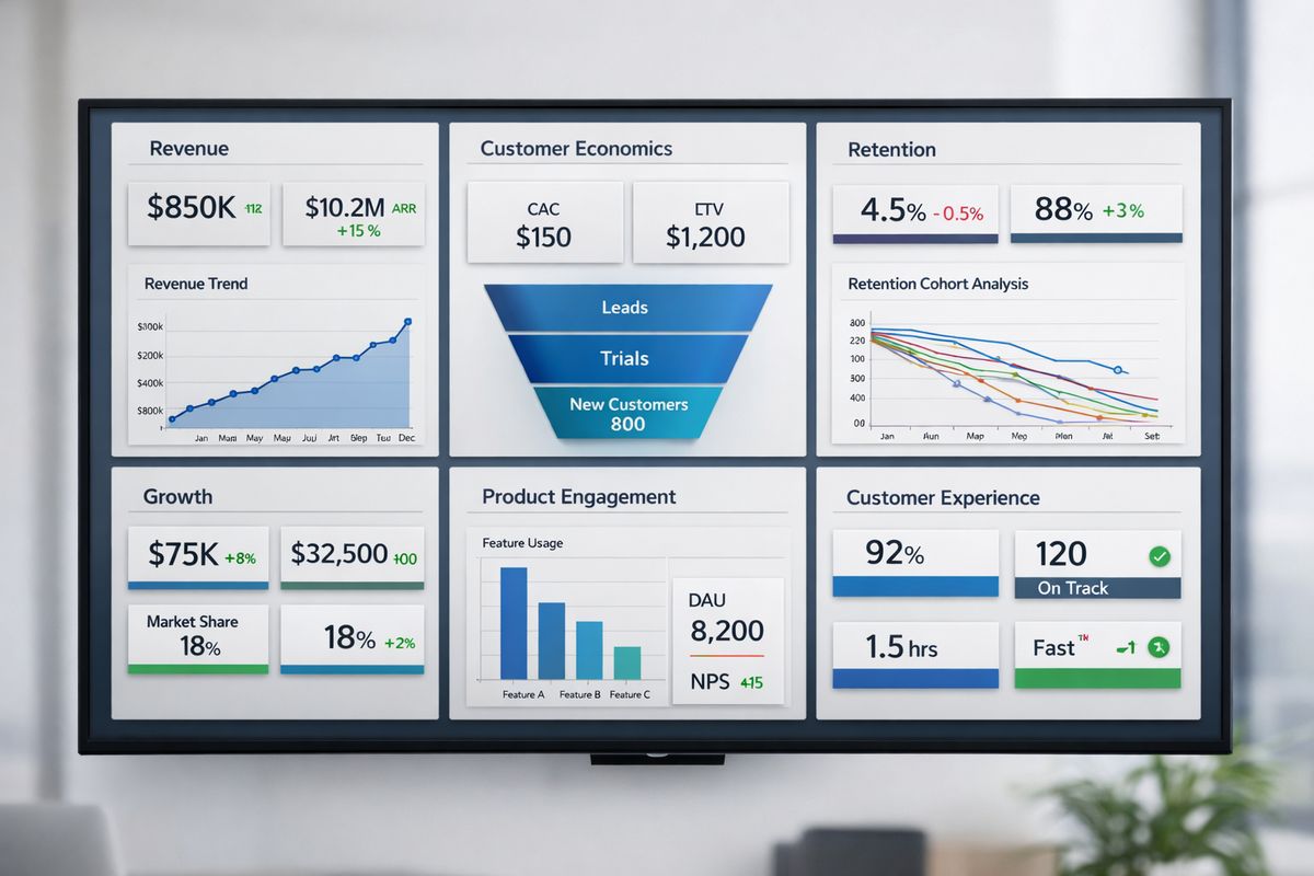
The easiest way to keep the dashboard usable is to group metrics by outcome: revenue, customer economics, retention, growth, product engagement, and customer experience.
Revenue Metrics
Revenue belongs near the top because recurring revenue is the clearest scorecard in SaaS. It tells you whether growth is real, how predictable it is, and whether customer expansion is offsetting loss.
MRR and ARR
MRR, or monthly recurring revenue, tracks predictable subscription revenue generated each month. ARR, or annual recurring revenue, is typically MRR multiplied by 12, though some businesses calculate it from annual contract values directly. MRR is more useful for fast-moving monthly tracking. ARR is better for bigger-picture planning and board conversations.
Use both to understand momentum. If MRR is growing steadily but new bookings are slowing, your current month still looks healthy while future months start weakening. That is exactly why trend lines matter more than isolated snapshots.
ARPU or ARPA
ARPU means average revenue per user. ARPA means average revenue per account. The distinction matters because some products sell to individual users while others sell to teams or companies.
This number helps you see monetization quality. If customer count rises but ARPA falls, you may be attracting lower-value accounts or discounting too aggressively. If ARPA climbs after packaging changes, that can validate pricing strategy in a way raw signup volume never will.
Net Revenue Retention (NRR)
NRR shows how much recurring revenue you keep from existing customers over a period after accounting for churn, downgrades, and expansion. It is one of the cleanest measures of SaaS health because it captures both loss and growth inside your installed base.
A business with strong NRR can grow even if new customer acquisition slows. A business with weak NRR has to keep replacing lost ground. If you want a stronger handle on this layer of reporting, it helps to understand which business numbers deserve the most attention before adding more tiles to your dashboard.
Customer Economics Metrics
Growth gets expensive fast when you do not understand unit economics. This group tells you whether your customer acquisition engine makes financial sense.
Customer Acquisition Cost (CAC)
CAC is the total cost of acquiring customers over a period divided by the number of new customers acquired. That usually includes ad spend, sales salaries, commissions, marketing software tied to acquisition, and program costs. The big mistake is undercounting. Leaving out headcount or agency spend makes CAC look cleaner than reality.
Track CAC by channel when possible. Paid search, outbound sales, partnerships, and product-led conversion paths often have very different economics.
Customer Lifetime Value (LTV)
LTV estimates the total value a customer brings over the duration of the relationship. In plain English, it answers a simple question: once you win a customer, how much is that customer worth before leaving?
LTV depends heavily on retention, pricing, and gross margin. That is why it should never be treated as a static finance number. If churn worsens, LTV shrinks. If expansion improves, LTV rises. If you want a practical breakdown of the formulas behind this, this deeper look at startup performance indicators helps connect the math to real operating decisions.
LTV:CAC Ratio
The LTV:CAC ratio compares customer value to acquisition cost. It is a quick read on growth efficiency.
A healthy ratio suggests you are acquiring customers profitably enough to justify continued investment. A weak ratio signals that growth may be too expensive, retention too weak, or both. But do not stop at the ratio itself. A “good” number can still hide a slow payback period or poor cash timing.
Retention and Churn Metrics
Retention is where sustainable SaaS businesses separate from leaky ones. If customers leave too quickly, acquisition becomes a treadmill.
Customer Churn Rate
Customer churn rate, often called logo churn, measures the percentage of customers who cancel during a period. Monthly churn works well for SMB-focused products with shorter cycles. Annual churn can be more useful for enterprise motions with longer contracts.
Low churn can still hide a problem if your biggest accounts are the ones leaving. That is why customer churn should always be paired with revenue churn.
Revenue Churn
Revenue churn measures recurring revenue lost from existing customers through cancellations and downgrades. Gross revenue churn shows pure loss. Net revenue churn includes expansion, so strong upsell performance can offset loss.
That distinction matters. Losing five small customers is very different from losing one major account. If retention is your biggest pressure point, this guide to the numbers that show customer stickiness is worth keeping nearby.
Customer Retention Rate
Customer retention rate flips churn into a more positive frame by showing the percentage of customers you keep. The formula is simple. The value is bigger than it looks.
Retention deserves equal billing with acquisition because it compounds. Better retention raises LTV, improves NRR, lowers effective CAC pressure, and usually makes product growth easier.
Growth and Pipeline Metrics
These are your forward-looking numbers. They tell you whether future revenue is building or stalling.
Signups and Product-Qualified Leads (PQLs)
Signups matter, but raw volume can be misleading. A flood of low-intent trials can make your top line look active while your downstream funnel weakens.
PQLs, or product-qualified leads, are users or accounts showing in-product behavior that signals buying intent. For product-led SaaS, that can mean inviting teammates, reaching a usage limit, integrating another tool, or returning repeatedly within the first week. PQLs are often a far better early signal than simple registrations.
Conversion Rate to Customer
Conversion rate should match your sales motion. For self-serve SaaS, the key step may be signup-to-paid. For a sales-led motion, it may be lead-to-opportunity or opportunity-to-close. For hybrid models, you may need more than one conversion view.
The point is not to track every possible handoff on the main dashboard. The point is to track the conversion stage that best predicts growth bottlenecks.
Lead Velocity Rate (LVR)
LVR measures the growth rate of qualified leads month over month. It is especially useful when revenue lags behind sales activity because your cycle takes weeks or months.
That makes LVR a leading indicator. Closed revenue tells you what already happened. LVR hints at what is coming next.
Product Engagement Metrics
Usage data helps you predict retention before churn shows up. That is why product metrics deserve more space on a SaaS dashboard than many leadership teams initially give them.
Active Users
Active users usually show up as DAU, WAU, or MAU, meaning daily, weekly, or monthly active users. The right one depends on how often your product is naturally used.
A team chat product may need daily activity. A payroll platform may be healthier on monthly activity. Pick the rhythm that matches real customer behavior, otherwise you end up judging a product by the wrong clock.
Activation Rate
Activation rate measures how many new users reach a meaningful first-value moment. That might be creating a first project, connecting data, publishing a page, inviting collaborators, or sending a first campaign.
This is one of the best early indicators in your dashboard because it tells you whether onboarding is working. If signups rise but activation falls, growth is already weaker than it looks.
Feature Adoption
Feature adoption tracks how many users engage with a specific feature, usually one tied to retention, differentiation, or expansion. This is how you connect roadmap work to business outcomes.
Not every feature deserves dashboard space. Focus on the ones linked to upgrading, reduced churn, or lower support load. If product usage is a big part of your motion, this breakdown of the usage patterns worth tracking can help you choose smarter signals.
Customer Experience Metrics
Support and satisfaction numbers often warn you before revenue does. Ignore them, and churn becomes a lagging surprise.
Net Promoter Score (NPS)
NPS measures customer willingness to recommend your product. It can be useful as a directional sentiment signal, especially when tracked over time and segmented by account type or lifecycle stage.
But do not give it too much power alone. A decent NPS does not cancel out weak retention, and a bad score without churn may point to fixable friction rather than structural problems.
Support Ticket Volume
Ticket volume tells you how much help customers need and where product friction may be building. A spike after a release can point to bugs, confusing UI changes, or onboarding issues.
Look at the trend, not just the count. Rising ticket volume alongside falling activation is a very different story than rising volume during rapid customer growth.
First Response Time and Resolution Time
First response time tells you how quickly a customer hears back. Resolution time tells you how long it takes to actually solve the issue. Fast replies feel nice, but they are not the same as fast outcomes.
Track both. If response times look great while resolution drags, you may have a process problem hiding behind a friendly front door.
How to Choose the Right KPIs for Your Stage and Business Model
Copying another company’s dashboard is one of the fastest ways to build something impressive and useless.
The right KPIs depend on your stage, pricing model, sales motion, customer type, and current bottleneck. A seed-stage product does not need the same dashboard as a multi-product enterprise platform.
Early-Stage SaaS
At an early stage, the dashboard should stay lean. Focus on activation, early retention, burn, runway, and the first signs of recurring revenue.
This stage is about learning whether customers get value fast enough to stick. Fancy segmentation can wait. Clear signals about onboarding, usage, and retention cannot.
Growth-Stage SaaS
Once growth starts to scale, efficiency matters more. CAC, LTV, payback period, NRR, channel performance, and segment-level retention move closer to the center of the dashboard.
This is also the stage where team accountability matters more. You are no longer just asking whether the product works. You are asking whether growth is durable and efficient.
Enterprise or Multi-Product SaaS
For enterprise or multi-product SaaS, blended averages become dangerous. You need segmentation by product line, customer size, geography, contract type, and cohort.
Expansion revenue, sales cycle length, renewal rate, account health, and implementation milestones often deserve dedicated sections. Otherwise one strong segment can hide weakness elsewhere.
By SaaS Model: PLG, Sales-Led, or Hybrid
Product-led growth puts more weight on signup quality, activation, PQLs, self-serve conversion, and in-product expansion signals. Sales-led models care more about pipeline health, win rate, sales cycle length, and new logo revenue. Hybrid businesses need both.
That sounds simple, but here’s where it gets interesting: hybrid dashboards often fail because they jam both motions together without context. Separate views can work better than one crowded screen.
How to Structure Your SaaS KPI Dashboard So It’s Easy to Read
A dashboard should make sense in under a minute. Think of it like glancing at your car dashboard at a red light. You want the headline state instantly, then the ability to look closer if something seems off.
Put Executive KPIs at the Top
The top row should hold your headline numbers. For most SaaS businesses, that means some mix of MRR, NRR, churn, CAC, LTV, and runway or burn.
These are your “is the business okay?” metrics. If the top row is cluttered with lower-level activity, your dashboard loses its job.
Group Metrics by Function
Below the headline row, organize by function: revenue, acquisition, product, customer success, finance. This makes the dashboard intuitive and prevents one part of the business from swallowing the rest.
It also makes ownership clearer. Each section has natural users and natural follow-up actions.
Use Trends, Targets, and Time Comparisons
A single number without context is barely useful. Show trends over time, month-over-month shifts, quarter-over-quarter changes, and goal-versus-actual views.
That extra context turns a dashboard from a scoreboard into a decision tool. If churn is 3.2 percent, is that improving, worsening, or seasonal? The answer matters more than the number alone.
Highlight Exceptions, Not Just Totals
Good dashboards draw attention to changes that matter. That can mean color thresholds, alerting, annotations, or small notes tied to launches and pricing updates.
If trial-to-paid conversion drops the same week you changed onboarding, your dashboard should make that connection easy to spot. Otherwise you are just decorating a screen.
SaaS KPI Dashboard Examples by Team
https://www.youtube.com/watch?v=B7k5rOgmOGY
One dashboard rarely serves everybody equally well. Shared headline numbers matter, but team views should reflect team decisions.
Executive Dashboard
An executive dashboard should focus on growth, retention, cash, efficiency, and top risks. That means recurring revenue, NRR, churn, burn, runway, CAC, and maybe one or two leading indicators like activation or pipeline health.
The job here is quick clarity. You should be able to open it at 8:57 a.m. and know what deserves attention before the 9 a.m. leadership call.
Sales Dashboard
A sales dashboard should highlight pipeline coverage, win rate, sales cycle length, new MRR, expansion revenue, and quota progress. If your team sells into larger accounts, stage conversion and deal aging also matter.
The point is not to create a motivational scoreboard. It is to show whether pipeline quality is strong enough to support revenue targets.
Marketing Dashboard
Marketing needs traffic, signups, PQLs, CAC by channel, conversion rates, and paid versus organic performance. Channel-level visibility matters because aggregate CAC can hide a failing acquisition source.
Keep attribution realistic. Perfect attribution is rare. Useful attribution is enough.
Product Dashboard
A product dashboard should focus on activation, active users, trial-to-paid conversion, cohort retention, feature adoption, and usage trends around key workflows.
This view is where product decisions start to connect directly to business outcomes instead of staying in feature-land.
Customer Success Dashboard
Customer success should see churn risk, renewal rate, account health, support volume, NPS, and expansion opportunities. It should help prioritize intervention, not just report outcomes after the fact.
That usually means combining usage, support, and renewal timing into one view.
Finance or Board Dashboard
Finance and board dashboards need ARR, burn rate, runway, gross margin, net new MRR, collections, and forecast accuracy. Keep it tighter, less operational, and more focused on predictability.
Boards do not need thirty charts. They need confidence in the business model and visibility into risk.
Building Your Dashboard: Step-by-Step
A useful dashboard usually starts smaller than you think. That is a good thing.
Step 1: Start With Decisions, Not Data
Before choosing metrics, write down the decisions your dashboard should support. Are you growing efficiently? Are customers sticking? Is onboarding improving? Is one channel getting too expensive?
If a metric does not help answer a real business question, it probably does not belong.
Step 2: Define Each Metric Clearly
Write down the formula, reporting window, source system, and owner for every KPI. That sounds boring because it is, but it prevents endless confusion later.
“Churn” should mean one thing. “Active user” should mean one thing. If definitions shift by department, trust disappears.
Step 3: Connect the Right Data Sources
Most SaaS dashboards pull from billing systems, CRMs, marketing platforms, product analytics, support tools, and sometimes a warehouse or BI layer that cleans everything up.
This is where bad data usually sneaks in. Missing IDs, duplicate accounts, inconsistent timestamps, and manual imports can quietly distort your dashboard.
Step 4: Choose Your Dashboard Tool
Pick a tool based on integrations, refresh speed, drill-down ability, permissions, and ease of use. A dashboard nobody opens is a design failure, not just a data problem.
Early on, a spreadsheet or lightweight BI setup may be enough. Later, automation and governance matter more.
Step 5: Build, Test, and Trim
Start with the minimum useful version. Then test it in real meetings.
If a chart never changes a decision, cut it. If one metric keeps raising questions, clarify the definition or add context. The best dashboards get sharper by losing weight, not gaining it.
Common SaaS KPI Dashboard Mistakes to Avoid
Most ignored dashboards have the same problems. They look polished, but they do not help anybody decide faster.
Tracking Too Many Numbers
More charts do not create more insight. They bury the signal.
If your main dashboard needs scrolling, it is probably trying to do too much. Keep detail in supporting views.
Mixing Definitions Across Teams
This one wrecks trust fast. If finance calculates MRR differently from sales, or product defines active users differently from success, every meeting becomes a negotiation.
Agree on definitions once, document them, and stick to them.
Relying on Lagging Indicators Only
Revenue and churn matter, but they tell you what already happened. Leading indicators like activation, PQLs, expansion pipeline, and support friction give you a chance to act earlier.
That balance matters. Lagging numbers confirm. Leading numbers warn.
Ignoring Segmentation
Blended averages are comfortable and misleading. You need cuts by plan, channel, customer size, geography, and cohort whenever those differences shape outcomes.
A healthy-looking average churn rate can hide a disaster in one segment.
Updating Too Slowly
Dashboard freshness should match decision speed. Financial close metrics can refresh monthly or weekly. Product activation and pipeline signals may need daily updates.
A stale dashboard trains people to ignore it. Once that habit forms, it is hard to reverse.
Best Practices for Making Your Dashboard Actually Useful
Building the dashboard is only half the job. The real win comes when it becomes part of how your business runs.
Review KPIs on a Clear Cadence
Set a rhythm that matches the metric. Operational numbers may need daily review. Team performance often fits weekly. Strategic trends usually belong in monthly reviews.
Consistency matters more than intensity. A dashboard checked casually once a month turns into wallpaper.
Add Context With Notes and Benchmarks
Numbers need context. Add notes for launches, campaign changes, pricing updates, outages, and anything else that affects interpretation.
Benchmarks help too, as long as you use them carefully. Internal baselines are often more useful than chasing broad industry averages with totally different business models.
Give Each KPI an Owner
Every KPI should have somebody responsible for watching it, explaining movement, and pushing action when needed. Ownership turns metrics into management tools instead of passive displays.
The goal is not blame. It is faster response.
Revisit the Dashboard as Your Company Changes
Your dashboard should evolve as your business does. New pricing, new products, a bigger sales team, a shift toward PLG, all of that changes which numbers deserve top billing.
A dashboard built for last year’s business can quietly become irrelevant.
A Simple SaaS KPI Dashboard Template to Start With
https://www.youtube.com/watch?v=s8_Vax8VUmM
If you need a starting point, keep it lean. Three rows is plenty.
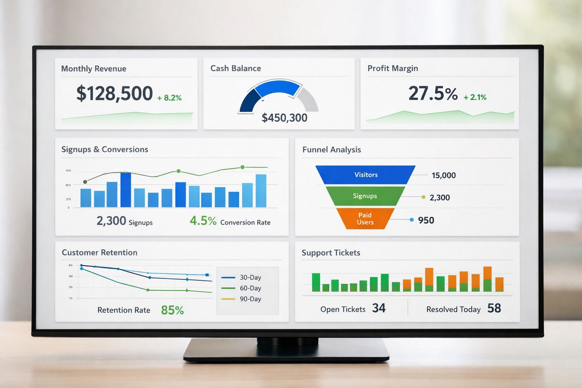
Top Row: The 6 Numbers to Watch First
Start with MRR, NRR, customer churn, CAC, LTV, and runway or net burn. Those six numbers give you a fast read on revenue health, retention quality, growth efficiency, and cash position.
If you only build one part this week, build this row first.
Middle Row: Acquisition and Activation
Use the next row for signups, PQLs, conversion rate, activation rate, and channel performance. This shows whether growth starts healthy or just looks busy at the top of the funnel.
For many SaaS companies, this is where problems show up before revenue feels the hit.
Bottom Row: Retention and Customer Health
Finish with customer retention, active users, support volume, NPS, and expansion signals. This row tells you whether customers keep getting value after the initial conversion.
If you want more ideas for choosing practical headline measures, these concrete KPI patterns for SaaS teams can help you pressure-test your setup.
Tools and Data Sources That Power a Strong Dashboard
A dashboard is only as trustworthy as the systems feeding it. Pretty visuals cannot fix messy source data.
Billing and Revenue Systems
Billing platforms, invoicing tools, and revenue recognition systems keep MRR, ARR, upgrades, downgrades, and collections grounded in reality. If subscription data is messy here, the rest of the dashboard gets shaky fast.
Pay extra attention to paused accounts, discounts, refunds, and annual plans split across reporting periods.
CRM and Marketing Platforms
Your CRM and marketing stack feed lead source, stage movement, spend, campaign performance, and conversion data. This is where acquisition reporting often gets distorted by inconsistent lifecycle stages or poor attribution hygiene.
Clean stage definitions matter more than fancy dashboards.
Product Analytics and Event Tracking
Product analytics power activation, feature adoption, active users, and PQL logic. This layer depends on clean event naming and a clear idea of what “value” looks like in your product.
If events are over-instrumented or inconsistently named, your dashboard becomes noisy fast.
Support and Success Platforms
Ticketing systems, CS tools, satisfaction surveys, and health scoring round out the picture. These signals often explain retention changes before finance numbers catch up.
That is why support data deserves a seat in the dashboard, not a separate corner nobody checks.
FAQs About SaaS KPI Dashboards
What should be on a SaaS KPI dashboard?
A strong SaaS KPI dashboard usually includes revenue, acquisition, retention, product engagement, customer economics, and customer health metrics. The exact mix depends on your stage and model, but most dashboards should include some version of MRR, churn, CAC, LTV, NRR, activation, and retention.
How many KPIs should your dashboard include?
For an executive dashboard, 8 to 15 KPIs is usually enough. Team dashboards can go a bit deeper, but once your main view turns into a wall of charts, focus drops and people stop using it.
How often should you update your dashboard?
Update frequency should match the decision. Product and pipeline metrics often need daily refreshes. Team performance can work weekly. Financial and board-level metrics may only need weekly or monthly updates, depending on reporting cadence.
What’s the difference between an executive dashboard and a team dashboard?
An executive dashboard gives you a high-level view of business health, usually focused on growth, retention, efficiency, and cash. A team dashboard goes deeper into the specific drivers that a function can act on, like pipeline stages for sales or activation cohorts for product.
Can you build a SaaS KPI dashboard in a spreadsheet?
Yes, especially for an early version. The problem shows up as your business gets more complex. Manual updates, broken formulas, trust issues, and slower refresh cycles make spreadsheets harder to maintain as a real source of truth.
Your First 30 Days: How to Put the Dashboard to Work
A dashboard starts paying off when you use it in real operating rhythms, not when it looks finished.
Week 1: Pick the KPIs That Matter Most
Choose a small set tied to your current bottleneck. If growth is expensive, prioritize CAC, payback, and conversion. If retention is shaky, prioritize churn, activation, and usage depth.
Do not start with everything. Start with the problem that keeps showing up.
Week 2: Clean Up Definitions and Sources
Give each KPI one formula and one trusted source. Document edge cases, such as trials, refunds, paused subscriptions, or multi-seat accounts.
That cleanup work is less exciting than building charts, but it is the part that makes the charts believable.
Week 3: Build the First Version
Launch a simple first dashboard, even if it is not perfect. Open it Monday morning before the 9 a.m. standup and use it to run the conversation.
That moment matters. A dashboard becomes useful when it starts replacing guesswork in live decisions.
Week 4: Review, Fix, and Keep Only What Helps
After a few real reviews, look at which numbers changed decisions and which ones just sat there. Remove clutter. Tighten definitions. Add one missing signal if needed.
Then do one simple thing: build the top row first and use it in your next weekly review. If you want a faster way to turn your SaaS KPI dashboard into something your team actually checks, try AtSpart and start with the numbers that move your business.