What a Revenue Dashboard Actually Does (And Why It Matters Now)
A revenue dashboard is a financial monitoring tool that gives finance and RevOps teams a live, consolidated view of where their company's money is coming from — and whether that revenue is healthy, growing, or at risk.
Quick answer:
- What it is: An interactive tool that pulls data from billing, CRM, and accounting systems to display key revenue metrics in real time
- What it tracks: MRR, ARR, churn, expansion, net revenue retention, ARPU, and segment mix
- Who uses it: Finance leads, RevOps teams, founders, and executives
- Why it matters: It replaces slow monthly reports and manual spreadsheet reconciliation with always-current visibility
Here's the problem most finance and RevOps leads know too well: by the time a monthly revenue report lands, it's already outdated. Decisions got made — or delayed — based on stale numbers.
Modern revenue dashboards change that. They update automatically, often daily, pulling data straight from your billing system, accounting software, and CRM. Instead of waiting weeks for a report, you can see how MRR is moving today.
And it's not just about speed. A good revenue dashboard doesn't just show you a headline number — it breaks that number down by what's driving it. New customers. Expansions. Contractions. Churn. Segment mix. Revenue quality.
That's the difference between knowing your MRR and actually understanding it.
What is a revenue dashboard and Why Does It Matter?
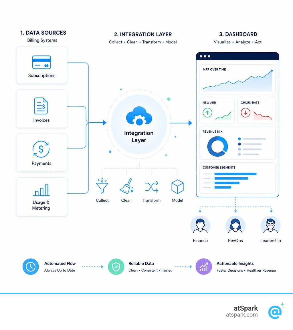
At its core, a revenue dashboard consolidates your critical financial data from accounting software, billing systems, and customer databases into a single visual interface. This gives your team real-time visibility into income streams and profitability metrics without requiring anyone to spend hours copying and pasting data into spreadsheets.
In business strategy and daily decision-making, having access to an automated financial tracking system is the difference between steering a ship with a map versus looking out the back window. By tracking SaaS Business Metrics continuously, leadership teams can spot growth trends, identify seasonal patterns, and catch churn risks before they turn into full-blown crises.
How a revenue dashboard Differs from Sales and Finance Dashboards
It is easy to confuse a revenue dashboard with other business intelligence tools, but they serve entirely different purposes:
- Sales Dashboards: These are built for the sales pipeline. They track activities like cold calls, emails sent, deals won or lost, individual rep quotas, and total contract value (TCV). They tell you what might happen in the future, but they do not account for recognized revenue or cash collection.
- Financial Dashboards: These focus on the overall financial health of the company. They are built around traditional accounting frameworks—like cash flow statements, balance sheets, general ledger codes, and expenses. They are highly focused on historical compliance and cash-on-hand.
- Revenue Dashboards: These bridge the gap. They focus strictly on how income is generated, recognized, and retained. By using accrual accounting principles, a revenue dashboard tracks recurring revenue, subscription lifecycles, and the underlying health of your customer contracts.
The Strategic Importance of Tracking Revenue Quality
Not all revenue is created equal. A company making $10 million in ARR from a single customer is in a far more fragile position than a company making $10 million from 1,000 customers. This is why tracking revenue quality is so critical.
Revenue quality describes how durable and expandable your income is. High-quality revenue is characterized by:
- Strong durability: Customers stick around for years, resulting in a low churn rate.
- High expandability: Customers regularly upgrade their plans or buy add-ons.
- Low concentration risk: No single customer accounts for a dangerous percentage of your total income.
- Predictable collection: Invoices are paid on time, and billing cycles are automated.
By using your dashboard to monitor these qualitative factors alongside raw growth numbers, you can ensure your business is scaling on a solid foundation. For a deeper dive into which metrics matter most, check out our guide on SaaS Metrics to Track.
Core Metrics and KPIs to Track
To build a balanced revenue dashboard, you must track both growth metrics (which show how fast you are moving) and quality metrics (which show how stable your business is).
| Metric Category | Key Performance Indicator (KPI) | What It Measures | Why It Matters |
|---|---|---|---|
| Growth | Monthly Recurring Revenue (MRR) | Predictable revenue generated each month | The baseline health of a subscription business |
| Growth | Annual Run Rate (ARR) | Current MRR projected over 12 months | The headline number investors ask for first |
| Growth | Average Revenue Per User (ARPU) | Average revenue generated per customer | Shows if you are successfully moving upmarket |
| Quality | Net Revenue Retention (NRR) | Revenue retained from existing customers | Measures product value and expansion success |
| Quality | Churn Rate | Percentage of customers or revenue lost | Indicates product-market fit and customer satisfaction |
| Quality | Customer Lifetime Value (LTV) | Total revenue expected from a single customer | Helps determine sustainable acquisition budgets |
For a broader look at how these fit together, see our list of Important SaaS Metrics.
Essential Metrics for a Subscription revenue dashboard
In subscription-based business models, your primary focus is recurring revenue. Your dashboard should instantly display your Monthly Recurring Revenue (MRR) and Annual Run Rate (ARR).
As noted in the Revenue analytics dashboard - Docs - PostHog , ARR is calculated simply as:
$$\text{ARR} = \text{MRR} \times 12$$
While ARR assumes your current revenue will continue for the next 12 months without any changes, it is an essential benchmark for valuations.
To get real value from your dashboard, you need an MRR breakdown. This splits your net MRR change into its core drivers:
- New MRR: Revenue from brand-new customers.
- Expansion MRR: Revenue from existing customers who upgraded, added seats, or bought add-ons.
- Contraction MRR: Revenue lost when existing customers downgraded to cheaper plans.
- Churned MRR: Revenue lost when customers cancelled their subscriptions entirely.
Retention and Customer Value KPIs
To understand long-term profitability, your dashboard must display customer retention and value metrics.
- Net Revenue Retention (NRR): This tracks the percentage of recurring revenue retained from existing customers over a set period, including expansion and deducting contraction or churn. An NRR over 100% means your existing customer base is growing on its own—the holy grail of SaaS.
- Customer Lifetime Value (LTV): This represents the total net revenue you expect to generate from a customer over their entire relationship with your company. LTV is calculated as:
$$\text{LTV} = \frac{\text{ARPU}}{\text{Churn Rate}}$$
- Churn Rate: Calculated as the number of churned customers divided by the total number of active customers during a period. If your churn rate is high, your LTV will drop, making it incredibly expensive to grow.
To see these metrics in action with real-world scenarios, review these SaaS KPI Examples.
Key Components and Visual Elements of an Effective Dashboard
An effective revenue dashboard needs to be highly visual and intuitive. It should present complex financial data in a way that allows anyone on your team to extract actionable insights in seconds.

When designing your interface, you can draw inspiration from modern layout blocks, such as those showcased in the Dashboard 1 - Revenue Dashboard - Shadcnblocks.com design. A great dashboard typically features a collapsible sidebar for easy navigation, prominent KPI cards at the top showing month-over-month changes with semantic coloring (green for growth, red for contraction), and interactive charts below.
Essential Charts and Breakdowns
To make your data easy to digest, use different visualizations for different types of data:
- Line Charts: Best for displaying historical trends over time, such as your total MRR growth, ARPU trends, or monthly billing trends.
- Donut and Pie Charts: Perfect for visualizing your customer segment mix (e.g., Enterprise vs. Mid-market vs. SMB) or revenue by sales channel.
- Stacked Bar Charts: Excellent for showing your MRR breakdown month-over-month, allowing you to see new growth, expansion, and churn stacked in a single column.
- Tables: Best reserved for granular data, such as listing your top customers by revenue contribution or calling out the specific accounts driving the largest expansion or contraction movements.
Controls, Filters, and Granular Data Views
Your dashboard should allow users to slice and dice data on the fly. Essential interactive controls include:
- Date Range Filters: Allowing users to view data over the last 30 days, 6 months, 365 days, or custom fiscal periods.
- Currency Conversion: Crucial for international businesses. Your system should support multi-currency reporting, automatically converting transactions to your account's default currency using live exchange rates.
- Granular Data Tables: Below the high-level charts, users should be able to drill down into individual invoices, showing the invoice date, payment due date, gross revenue, taxes, and disbursement status.
- Operational Delays: It is important to note that customer charges typically display in these granular data sections 24 hours after the customer has been billed, giving your systems time to process and sync the transaction.
Customizing Dashboards for Different Business Models
There is no such thing as a one-size-fits-all revenue dashboard. Depending on how your business makes money, your reporting needs will vary wildly.
SaaS and Subscription Models
For subscription businesses, the focus is entirely on recurring contract value, plan tiers, and customer lifecycles. Your dashboard needs to track how customers move between different pricing tiers, when they expand, and when they contract.
Because subscription data is highly dynamic, your dashboard must integrate directly with your subscription management and billing systems to capture upgrades and downgrades automatically. To start building a dashboard tailored to these metrics, you can explore our SaaS KPI Dashboard template.
E-Commerce and Marketplace Models
E-commerce and marketplace models do not rely on recurring subscriptions. Instead, they track transactional volume, wholesale costs, and payment processing fees.
For example, if you sell digital products, sponsorships, or run a multi-seller marketplace, your dashboard should focus on:
- Gross Revenue vs. Seller Net Revenue: Tracking the total transaction volume versus the actual cut your business keeps after paying out merchants or suppliers.
- Transaction Fees and Listing Fees: Monitoring the friction costs associated with running your platform.
- Subscriber Geography and Sales Channels: Understanding where your buyers are located and which platforms (online checkout, point-of-sale, mobile apps) are driving the most transactions.
For a look at how digital creators and transactional businesses track these metrics, you can read about Understanding the Kit dashboard | Kit Help Center .
Implementation Challenges and Data Integration
The biggest hurdle to maintaining an accurate revenue dashboard is data fragmentation. Your financial data is likely scattered across billing platforms, accounting software, and CRMs.
To build a reliable single source of truth, your dashboard must support direct integrations with your core business tools:
- Billing & Payments: Stripe, PayPal, Shopify
- Accounting Software: QuickBooks Online, Xero
- CRM & Sales: Salesforce, HubSpot
- Product Analytics: PostHog, Mixpanel
Connecting Billing, CRM, and Accounting Systems
A modern revenue dashboard should support QuickBooks Online and Xero as primary data sources with automatic data export and transformation.
When you use modern integration platforms, the initial setup of a revenue dashboard typically takes no more than 5 minutes. You simply log into your accounting or billing software, authorize the connection, and the system automatically builds the necessary data pipelines to clean, transform, and visualize your financial metrics.
Overcoming Common Implementation Hurdles
During setup, you will likely encounter several common reporting challenges:
- Data Silos: Sales reps might record a deal value in Salesforce that does not match the actual invoice generated in QuickBooks. Establishing a governed data model ensures that your dashboard only pulls from verified billing sources.
- Delayed Invoicing: Upstream invoicing delays can temporarily distort your daily metrics. Revenue dashboards are typically updated daily at midnight UTC, but you should expect potential 1-2 day delays if invoicing or disbursement data from upstream systems is delayed.
- The Legacy Report Lag: In the past, finance teams had to wait for legacy monthly billed revenue reports, which were often delivered on the 15th day of the following month. Modern revenue dashboards solve this by displaying billed revenue approximately 45 days earlier than legacy monthly reports, giving you a massive head start on strategic adjustments.
The Role of AI and Automation in Modern Revenue Analytics
The days of staring at static bar charts and trying to guess why your revenue dropped last Tuesday are over. Artificial intelligence and automation have transformed how we interact with our financial data. To understand this shift, you can read our breakdown of What is AI Revenue Analytics.
Automated Forecasting and Projections
By analyzing your historical revenue data, machine learning algorithms can generate incredibly accurate monthly, quarterly, and annual projections. These systems automatically account for:
- Seasonal Patterns: Adjusting forecasts for summer slowdowns or end-of-year buying surges.
- Growth Trajectories: Identifying whether your expansion rate is accelerating or decelerating.
- Variance Analysis: Comparing your forecasted revenue against actual results in real time to measure and improve forecast accuracy.
For instance, as we look at revenue trends in July 2026, AI engines can instantly calculate whether your summer performance is on track to hit your Q3 targets, alerting you to any deviations before they impact your cash flow.
Conversational Analytics and Natural Language Querying
The most exciting evolution in modern business intelligence is the rise of conversational, governed analytics. Instead of waiting for an analyst to write complex SQL queries or build a new custom chart, business leaders can now ask plain-English questions directly to their data.
At atSpark, we have built our platform around this exact premise. You can type questions like:
- "What was our net revenue retention last quarter by customer segment?"
- "Show me a line chart of our MRR growth over the last 12 months."
- "Which customer accounts had the largest expansion in July 2026?"
The system instantly generates the exact chart, table, or insight you need—no SQL or engineering help required.
Frequently Asked Questions about Revenue Dashboards
What is the difference between a revenue dashboard and a sales dashboard?
A sales dashboard tracks pipeline activities, deal stages, and individual rep performance (e.g., quota attainment and contract value). A revenue dashboard tracks recognized, accrual-based revenue, subscription lifecycles (MRR/ARR), churn, and cash collection.
How long does it take to set up a modern revenue dashboard?
With modern integrations, the initial setup typically takes no more than 5 minutes. You simply connect your primary data sources (like QuickBooks, Xero, or Stripe), and pre-built templates will automatically generate your visualizations.
How often should revenue dashboard data be updated?
Modern dashboards are updated daily at midnight UTC. While some transaction data displays in granular sections 24 hours after a customer is billed, minor delays of 1-2 days can occur if upstream invoicing or disbursement systems experience processing lags.
Conclusion
A modern revenue dashboard is no longer a luxury for high-growth tech companies—it is an absolute necessity for any business that wants to make fast, data-driven decisions. By automating your data pipelines, tracking both growth and quality metrics, and customizing your views to match your specific business model, you can eliminate manual reporting and gain unparalleled visibility into your financial health.
At atSpark, we believe that accessing your financial insights should be as easy as having a conversation. Our AI-powered analytics platform unifies your billing, CRM, and subscription data, allowing your team to ask plain-English questions and get instant, governed charts and tables without writing a single line of SQL.
Ready to take control of your financial performance? Explore our SaaS KPI Dashboard and discover how conversational analytics can transform your business growth today.