Why Every Revenue Leader Needs an ARPU Dashboard for Executives
An arpu dashboard for executives is a centralized, real-time view that tracks Average Revenue Per User alongside the metrics that give it meaning — churn, LTV, MRR, and segment-level breakdowns — so leadership can make faster, better-informed decisions without waiting on a data team.
What should an executive ARPU dashboard include?
- ARPU trend line — monthly and quarterly, segmented by plan or customer tier
- ARPU vs. ARPPU — to separate paying-user revenue from free-tier dilution
- MRR and ARR — so ARPU is always read in the context of total recurring revenue
- LTV and CAC payback period — to validate whether ARPU justifies acquisition spend
- Churn rate by cohort — because rising ARPU alongside rising churn is a warning sign
- Segment-level ARPU — SMB vs. mid-market vs. enterprise, or by geography and channel
Here is the core problem: ARPU is one of the clearest signals of how efficiently your product converts users into revenue. But on its own, it can mislead you.
A blended ARPU number that looks healthy can hide a shrinking enterprise base, a flood of low-value free users, or a pricing structure that no longer fits the market. Most finance and RevOps leaders see this problem play out every quarter — the number looks fine in the board deck, but the underlying story is messier.
In 2026, that gap between reported ARPU and actionable ARPU is getting harder to ignore. Usage-based pricing, AI-tier upsells, and freemium conversion funnels all make ARPU more dynamic and more segmented than it used to be. A static spreadsheet or a single top-line figure simply doesn't cut it anymore.
The executives who use ARPU well don't just track it — they design dashboards around it so the right context is always visible alongside the number.
What is ARPU and Why is it a Critical Executive KPI?
Average Revenue Per User measures the average amount of revenue generated by a single user or account over a specific timeframe, typically calculated on a monthly or annual basis. While it may look like a simple division exercise, it is actually a foundational thermometer for your entire business model.
For C-suite executives, tracking ARPU is not just about keeping score; it is about validating your pricing power and product-market fit. When you look at your core SaaS Business Metrics, top-line revenue tells you how much you are growing, but ARPU tells you how efficiently you are growing.
Are you scaling by aggressively acquiring thousands of low-value, high-churn users? Or are you successfully expanding your footprint within high-value accounts that stay with you for years? ARPU gives you the answer.
Furthermore, ARPU acts as a direct validation of your product and pricing strategy. If you introduce new features, roll out premium AI-driven capabilities, or repackage your pricing tiers, a rising ARPU trend line confirms that your customers are willing to pay for the additional value you are delivering. Conversely, a flat or declining ARPU in a growing company signals that you are running on a customer-acquisition treadmill — a dangerous strategy that eventually runs out of steam.
Designing an Actionable ARPU Dashboard for Executives
Most corporate dashboards suffer from the "too many charts, not enough answers" syndrome. Operational teams need granular, tactical views, but a high-performing arpu dashboard for executives must prioritize high-level clarity, trend direction, and decision-readiness.
When designing a dashboard For CEOs, the focus must be on strategic levers: Is our pricing working? Are our expansion programs paying off? When designing For CFOs, the priority shifts to financial health: Does our ARPU support our customer acquisition costs? Is our revenue high-margin and highly predictable?
To satisfy both perspectives, a modern SaaS KPI Dashboard must move away from static, retrospective reporting. It should act as a dynamic "answer engine" where leadership can instantly spot anomalies and trace those changes back to their source systems without needing an analyst to write SQL.
Key Components of a Modern ARPU Dashboard for Executives
An executive-level dashboard must reconcile data across multiple departments. If your sales team, customer success team, and finance team all bring different revenue numbers to a board meeting, alignment collapses.
To build a reliable arpu dashboard for executives, you must integrate real-time data from three core pillars:
- Billing Systems (e.g., Stripe, Chargebee): To pull recognized recurring revenue, subscription changes, and refunds.
- CRM Platforms (e.g., Salesforce, HubSpot): To track account owners, customer tiers, and pipeline progress.
- Product Analytics (e.g., Mixpanel, Amplitude): To layer user engagement and feature adoption over revenue data.
When these systems are unified, executives can view real-time business health instead of waiting weeks for manual end-of-month reconciliations. To see what this looks like in practice, you can explore interactive layouts like the SaaS Executive Dashboard Demo or check out how automated insights are structured in the AI Executive Dashboard Demo.
Distinguishing Vanity Metrics from Actionable Insights on Your ARPU Dashboard for Executives
A blended, company-wide ARPU is often a vanity metric. If your overall ARPU is $150, that number might look stable, but it could mask a dangerous reality: your enterprise accounts (historically paying $2,000) are churning, while a massive wave of $15 SMB sign-ups is keeping the average afloat.
To make your arpu dashboard for executives truly actionable, you must break down blended averages into targeted segments:
- Segment-Specific ARPU: Group your customers by target market (SMB, Mid-Market, Enterprise). This allows you to monitor whether your enterprise-sales motion is actually yielding higher contract values over time.
- Cohort Analysis: Track ARPU by signup date. For example, does the Q1 2026 customer cohort have a higher ARPU at month three than the Q1 2025 cohort did? This tells you if your onboarding and early expansion loops are improving. For a deep dive into setting up these views, see our MRR Cohort Analysis Complete Guide.
- Acquisition Channel: Compare the ARPU of customers acquired via organic content against those from paid advertising or outbound sales. This helps you reallocate marketing budgets toward the highest-yielding channels.
How to Calculate ARPU and Avoid Common Analytical Pitfalls
The basic formula for ARPU is straightforward:
However, simple formulas can lead to costly analytical errors if you do not establish strict guidelines for what goes into the numerator and the denominator.
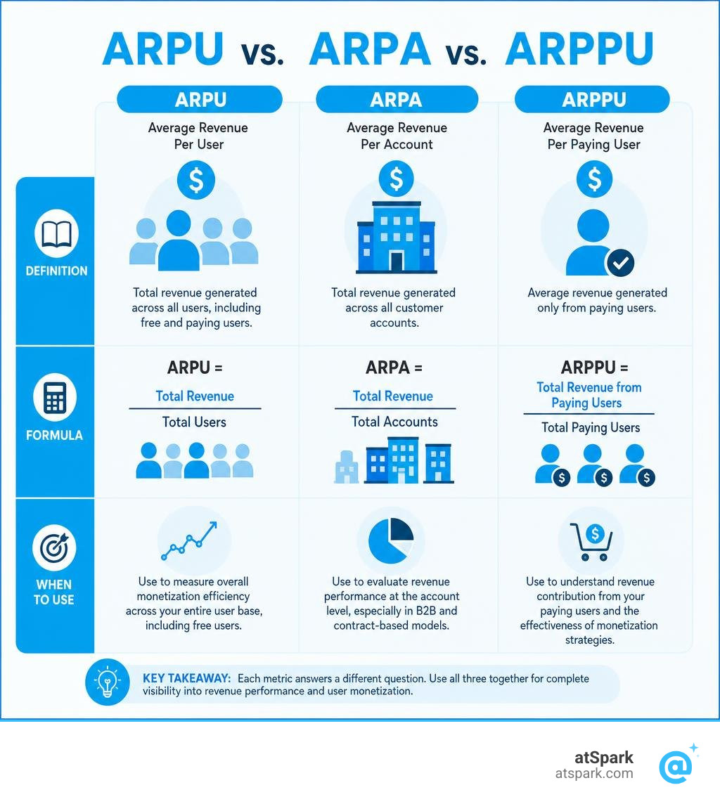
First, you must distinguish between ARPU (user-level) and ARPA (Average Revenue Per Account). In B2B SaaS, a single customer account (a business) might have 50 individual users. Calculating revenue per user in this scenario can skew your data, especially if you sell flat-rate site licenses. For B2B, ARPA is typically the more meaningful metric, whereas consumer-facing apps rely heavily on ARPU.
Second, you must decide how to handle free users. If you run a freemium model, including free users in your standard ARPU calculation will drag your average down, making it hard to see how well you are actually monetizing your paid customer base. To solve this, executives track ARPPU (Average Revenue Per Paying User), which excludes free-tier accounts from the denominator.
To make sure your calculations are grounded in true recurring business health, avoid these three common pitfalls:
- Using Total Revenue Instead of Recurring Revenue: Never include one-time setup fees, professional services, or custom development work in your ARPU calculation. These non-recurring inflows will artificially inflate your ARPU and distort your forecasting. Stick strictly to MRR or ARR.
- Ignoring Revenue Recognition Principles: ARPU should be based on recognized revenue, not cash collected or invoiced amounts. If an enterprise customer pays $12,000 upfront for an annual contract, your monthly ARPU calculation should only count $1,000 (the recognized portion) for that month.
- Mismatched Time Windows: Ensure that the revenue in your numerator covers the exact same time window as the active user count in your denominator. If you are calculating monthly ARPU, use the monthly recurring revenue and the average active users for that specific month. You can easily test these variables using our interactive MRR Calculator.
| Metric | Denominator | Best For | Executive Use Case |
|---|---|---|---|
| ARPU (Average Revenue Per User) | All Active Users (Free + Paid) | B2C Apps, Ad-Supported Models | Evaluating overall monetization efficiency across the entire user base. |
| ARPA (Average Revenue Per Account) | Total Active Accounts / Customers | B2B SaaS, Enterprise Software | Assessing contract values, tier migration, and account expansion health. |
| ARPPU (Average Revenue Per Paying User) | Paying Users Only | Freemium SaaS, Mobile Gaming | Measuring the monetization strength and pricing power of premium tiers. |
Connecting ARPU to LTV, CAC, and the Rule of 40
No metric exists in a vacuum. On your executive dashboard, ARPU should serve as the connective tissue that links your sales efficiency, customer retention, and overall financial viability.
First, ARPU is the primary driver of Customer Lifetime Value. LTV is calculated by multiplying your ARPU by your gross margin and dividing the result by your customer churn rate. If your ARPU increases, your LTV rises proportionally, giving you more capital to invest back into growth.
This directly impacts your Customer Acquisition Cost. A higher LTV allows you to tolerate a higher CAC, meaning your marketing and sales teams can bid more aggressively for high-value keywords or hire experienced enterprise reps.
A healthy SaaS business typically aims for an LTV:CAC ratio of 3:1 or higher, with a CAC payback period of under 12 to 18 months. If your ARPU is too low, your payback period stretches out, draining your cash reserves and limiting your growth. You can model these relationships dynamically using our LTV Calculator and CAC Calculator.
Furthermore, ARPU trends have a massive influence on the Rule of 40, which states that a SaaS company's combined growth rate and profit margin should exceed 40%. Raising your ARPU is one of the most capital-efficient ways to satisfy this rule.
Unlike acquiring new customers — which requires heavy upfront sales and marketing spend — raising ARPU from your existing customer base has virtually zero acquisition cost. This means expansion revenue drops straight to your bottom line, boosting your operating margins while simultaneously driving top-line growth.
Strategic Playbook: How Executives Drive ARPU Growth in 2026
If your dashboard reveals that your ARPU is flatlining, you do not necessarily need to resort to a blunt, company-wide price hike. In 2026, the most successful growth strategies rely on value-based pricing, intelligent packaging, and frictionless expansion.
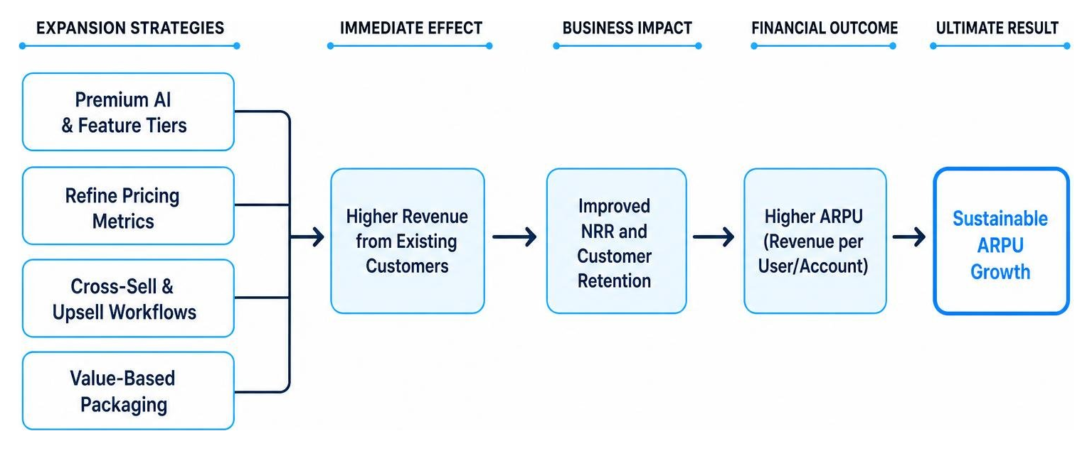
Here are four highly effective plays to increase your ARPU without damaging customer retention:
- Introduce Premium AI and Feature Tiers: Rather than charging more for the core product, package advanced capabilities (like predictive analytics, automated workflows, or generative AI features) into premium add-on tiers. This allows highly active, high-value users to self-select into higher price points while keeping your entry-level pricing competitive.
- Refine Your Pricing Metrics: If you are still relying solely on flat-rate per-user pricing, consider moving to a hybrid or usage-based model. Aligning your pricing with a value metric (such as data processed, API calls, or active contacts) ensures that as your customers grow and get more value from your software, your ARPU scales naturally alongside them.
- Build Systematic Cross-Sell and Upsell Workflows: Work closely with your customer success team to identify expansion triggers. For example, when an account reaches 80% of their current tier's usage limit, automate in-app notifications and personalized outreach to guide them toward an upgrade. This directly improves your Net Revenue Retention, which is a critical indicator of long-term business health.
- Enforce Discount Governance: Uncontrolled discounting during the sales cycle is an ARPU killer. Establish clear, automated approval thresholds in your CRM so sales reps cannot offer deep discounts without executive sign-off. Reducing average discount rates by even 5% can yield an immediate, noticeable lift in your monthly ARPU. To track these growth signals, monitor your core SaaS Growth Metrics.
Frequently Asked Questions about ARPU Dashboards
What is a realistic ARPU benchmark for B2B SaaS in 2026?
There is no single "good" ARPU because benchmarks vary wildly depending on your target market. According to industry data, median ARPU for B2B SaaS companies serving SMBs typically ranges from $100 to $200 per month. For mid-market focused companies, that average jumps to $500 to $1,500. Enterprise-focused SaaS companies often see ARPUs ranging from $5,000 to $10,000 or more.
Rather than comparing your business to unrelated sectors, focus on tracking your own internal trend lines and comparing your metrics against direct competitors with similar sales motions. You can learn more about interpreting these variations in our guide to SaaS Performance Metrics.
How does ARPU differ from MRR and ARR?
MRR (Monthly Recurring Revenue) and ARR (Annualized Recurring Revenue) measure the total size and velocity of your recurring revenue engine. ARPU, on the other hand, is a granular efficiency metric.
While MRR tells you the scale of your business, ARPU tells you how much value you are extracting from each individual customer on average. A business can grow its MRR by simply adding more customers, but it can only grow its ARPU by delivering more value per customer. For a complete breakdown of how these metrics interact, explore our resource on Important SaaS Metrics.
How often should executives review ARPU trends?
While operational teams might look at user signups and daily active usage on a weekly basis, executives should review ARPU trends monthly and quarterly. Monthly reviews allow you to spot early warning signs, such as a sudden dip in expansion revenue or an increase in down-selling.
Quarterly reviews are ideal for identifying seasonal trends, evaluating the long-term impact of pricing changes, and preparing reports For Investors.
Conclusion
An arpu dashboard for executives is more than just a collection of charts — it is a strategic lens that reveals the true health, scalability, and pricing power of your SaaS business. But to get these insights, you shouldn't have to wait on manual spreadsheet exports or fight with complex SQL queries.
At atSpark, we believe executives should have direct, frictionless access to their data. Our AI-powered analytics platform unifies your billing, CRM, and subscription data into a single, governed source of truth.
Instead of building dashboards from scratch, you can simply ask plain-English questions like "What is our ARPU by customer segment this quarter compared to last year?" and instantly receive beautiful, accurate visualizations.
Ready to transform how you track and report your revenue metrics? Explore What is AI Revenue Analytics?, learn how to Ask Your Data Anything Without SQL, or visit our ARPU Glossary Page to master the fundamentals of recurring revenue efficiency.